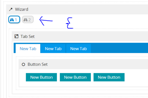
I have a Wizard component, which has a tabset in each of its steps, and a template component in each tab. Here’s a section of XML showing the structure


The issue is I see wasted whitespace above the tabset and between the tabset and the content of the tabs


Is there any way to style the wizard, tabset and tab components to control the height of these white spaces or remove them entirely? Thanks!


I don’t see the dead white space on this page XML below. Do you? What else are you doing to the page where this could be impacted?


THank you for your reply. In your page, I see it between the wizard and the tabset


The space remains when I remove the next steps action


and appears to be reserved for the "steps " in the wizard


To your point though the other gap between the tab and the template seems to be due to a css style we applied so I should be able to rectify that. Let me know if there’s any way to remove the gap caused by the wizard. Thanks!


This space is where the Next Steps buttons are located. You can see it on the far right for your first picture. If you want to remove all of the Next Step Actions, then I would recommend removing the wizard.


Yup, like I said. So it sounds like the answer is that there is no way to remove the space allocated to the next steps action in the wizard even after removing the next steps icon.


It sounds like this is something you’ll want to press “Me Too” on…
https://community.skuid.com/t/action-sequences-inside-wizard-should-always-have-navigate-…

The more people that vote on it, the more visibility it’ll have for our design team.