I want to show multiple records using the field editor and I want to visually separate the records for ease of editing. For example, we are using a field editor to build a view of our faculty at our school with fields for their professional experience, education, etc… I would like to see all of the fields for one faculty member and then have a visual space before I see the fields associated with the next record. Any idea how to create a visual space between one record and the next?
Put the field editor in a wrapper and add bottom border.
The field wrapper wraps all the records together as one. So any boarder go around all of them as if they are one unit. I want to see each record separated.
I would recommend trying the following:
1) Add a deck component selecting the main model.
2) Add a field editor to the deck component selecting the main model.
3) Set the context on the field editor to Id = Id.
Keep in mind you can adjust minimum card width on the deck component to adjust how the field editors fill up the screen.
Hmmm … I assumed it would put each field in a wrapper. Curious to see if the deck component suggestion works.
Alternatively, you can assign a class to the field editor and set the CSS styling.
Humm, maybe I am not on the latest version of skuid? Where is the deck component?
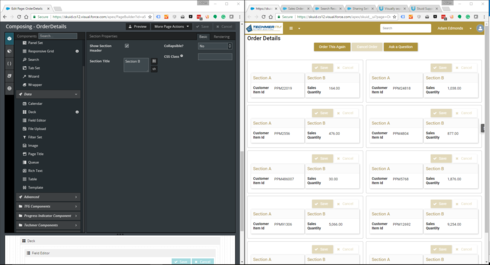
It is under the Data Section of the components. Deck Component on the left and Sample Deck/Field Editor on the right in the screenshot.

It is the “responsive grid” component?
This page is not a param page set to a single id.
We want to see numerous records in one object, not just a single record for one page.
Enter your E-mail address. We'll send you an e-mail with instructions to reset your password.

