We have a single Model Page we are using for a Visualization. We set some conditions to limit the data, very similar to a report we run. It is a Column Chart based on a single series that shows the average time of completion per State. We limit the records to the last 90 days, so for the Category (which is now by state) we would like to see by state for each month. So for North Carolina for instance, we would see what it is for each calendar month. Jan, Feb, Mar, etc. and so on.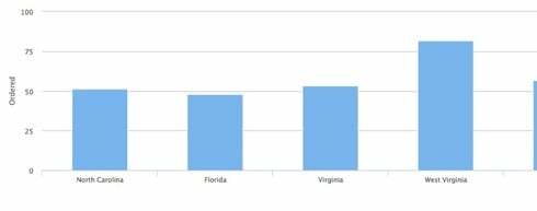

Page 1 / 1
Now I have another issue. We are using the Model Conditions to show specific client data only, so we had 3 conditions, works fine. When we add the 4th condition as shown, we get an Apex heap size too large: 6843647? 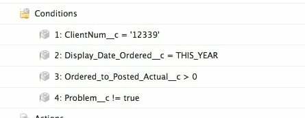
Not sure you can do this precisely the way you want, without javascript, where you categorize by State and Split by Month.
You can however categorize by Month and split by State.
The issue is that you can only “group” by the date using the Category on a date field in order to set the Date Granularity options.
What grouping logic do you have?
Can you provide a pic of the condition settings?
None as the default is treat them all as true, so I would assume with no Group Logic, the above would be 1 AND 2 AND 3 AND 4. If all pass then display, if not, don’t.
This is possible, but may have some issues you want to go to Javascript to address. There are two keys to making it work.
Correctly build an aggregate model that groups your data by state and month.
Add the month aggregation to your chart series properties as a Split field.
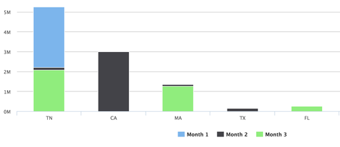
This is the result:
Here are some details.
**Aggregate Model: **
Change your model type on the advanced tab of the model properties. Aggregate models allow you to have salesforce do your processing on their servers rather than passing you all the records (and triggering the Heap Size Error)
Your aggregate field will probably be your average completion time.
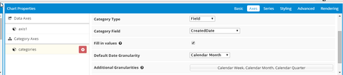
You need to add groupings by state, and by your chosen date. You want to choose the “Calendar Month” function for the date grouping.
You need to add another grouping by date (I’ll tell you why in a minute). To do this you need to go to the XML builder (link at the bottom of the builder page that is only active after you have saved your page). There find the calendar month grouping, copy it and make the following adjustments: Remove the Calendar Month function and change the “name” value in some way.
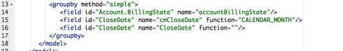
- Go to the advanced tab of the Model Propoerties and fill out the “Fields to order records by” section. This should your date field and then your state field. Both these fields also need to be grouped, which is why you had to do the wonky xml edit in step 4.
Chart Definition.
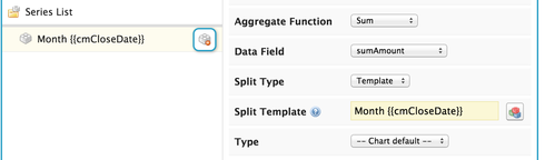
In your series properties make sure the following items are set.
Aggregate your data field so that it pulls together records appropriately.
Add a Split type of “Template”
The split template should be somthing like “Month: {{cmCloseDate}}” Here it is essential that you use the alias value provided in your model. Unfortunately the Calendar Month function only returns a number (1, 2, 3 etc) instead of the month name. This is why I’m using the template to add some context to the value. Getting the month name would require some custom javascript to update the model values for the cmCloseDate field.
And there you go… Enjoy.
If you want your month bars side by side, instead of stacked - go to the Styling tab of the chart properties and change the stacking property to OFF.
Custom or Standard object? If standard, care to post your XML?
oh yeah. Aggregate model. Doh!
Yeah, I got this working, sort of so now I display a table and a visualization, which basically replaces a SF Report. What is the best way to now present this to a user. For reports they access a folder, then run report, wala. Skuid, not quite sure how to get this to my user.
Here are a few options:
1. VF tab that wraps the skuid page
2. Put a link to the report on another page (a button or html link)
3. Send the user a direct link to the page and have them bookmark it.
So if we wanted to have a tab that was exposed to a client using our community. We have created the report with visualization called 12339ServiceReport (a skuid page), and the client has a skuid license. Can you provide the steps to create the tab and associate it with the skuid page using page assignments? Thanks in advance.
Here is a video deep dive on using Skuid with Communities…
https://www.youtube.com/watch?v=b4llxUBtgKQ&index=12&list=PLiN-Sna8J2xCcqj4sX5C-Zxfufz5lkWj5
The details about using a skuid page in a community start at about minute 13.
View our Community Site Map
Enter your E-mail address. We'll send you an e-mail with instructions to reset your password.