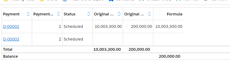
We’re looking at a requirement to create a table of payments that has a Total row, but also a row for a calculated Balance beneath the total (screenshot). Is there some other way to get the columns to align other than fixing the column widths? Or is there another way any one has done this sort of thing? Our client was not keen on displaying totals out of alignment with the columns (e.g. putting the totals in a different section / blocks above or below the table).
Page 1 / 1
You could try building a synthetic table by using a deck component with a responsive grid. That would allow you to mix components in each grid section and keep them vertically aligned.
Yes, something decks & grids was done on another page. There still need to be specific column widths to get everything to line up. Maybe there just isn’t a good way around this.
Sorry lisaa - there really isn’t a good way around this. Lots of finagling to get different components lined up. We haven’t implemented subtotal functionality in our Grids.
Reply
Enter your E-mail address. We'll send you an e-mail with instructions to reset your password.


