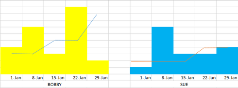
I’m trying to create a time trending chart of two kinds of data: actuals and goals.
For example, the actual might be number of Events per week/month, and the goal would be a custom object, where the records always have a date field (every Friday for the entire year). They reference the reps’ goals for that week, but can be accumulated for month/quarter/year expectations.
I’d like to be able to show the actuals split week over week as columns, and the goals to split as well. (They can change based on seasonality, so unfortunately I can’t just flatline them.)
Here’s a horrible mockup, but hopefully it paints a useable picture:

When I try to do this in a Skuid chart, I set the Actuals model to split by Month - no problem there.
But when I split the goal line by month, it makes separate lines (which makes sense, but isn’t what I want).
I feel like I should be using multiple categories here - one to split the reps, and another to split the dates - but I tried all the variants I could think of, and nothing shook out quite right.
Any thoughts/suggestions greatly appreciated, thanks!

