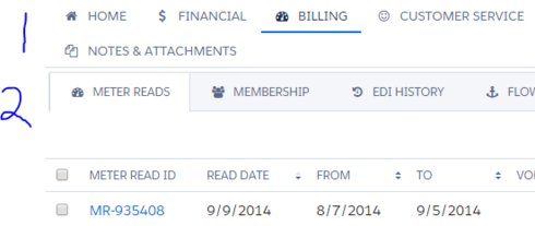
I have been re-skinning all of my skuid pages with the skuid-built “Lightning Design” theme. It looks pretty awesome! One thing that I have heard mentioned, is that there aren’t clear lines between certain things. For example, in tabsets, the tabs are not separated by lines, rather, they are separated by whitespace. Personally I like this, but my personal feelings aside, some users would like clear lines demarcating things. When you have tabsets within tabsets however, the look is quite different. Is there a way that I can simply apply the sub-tabset styling to the parent tabset as well?
Can I get 1 to look more like 2?
Page 1 / 1
Create a new theme. Use the Lightning Design theme as the basis. Fix the tabset. BAM.
Enter your E-mail address. We'll send you an e-mail with instructions to reset your password.

