I’ve just had my first play with the new chart component. It’s seriously impressive. I built a pretty killer four chart dashboard in about 5 minutes. Great start.
Just got it running in our sandbox and did a test pass on our existing pages (including in our Community, which has extensive snippets and customization) and nothing appears to have broken! Just started looking at the new features - and playing with queues with drawers with queues. Very cool...
Then I added a table so that I could make real time data changes and have them reflected in the charts. It’s not just great eye candy (although it is certainly that), but it’s great for scenario modelling because the charts reanimate without having to commit to a save.
Now it seems churlish to already start asking for more … but it’ll be great when we can template the tooltips. 
That’s what we expect Glenn. Customer feedback…
Would love to see how people are using the charting. I did a simple 2 chart with table page looking at client demographics but would love to see other people’s ideas. I agree with Glenn - great eye candy.
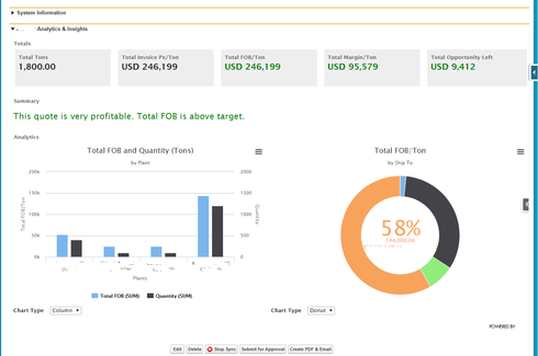
Here’s one example. Note that I had to redact to protect the innocent.

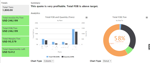
Different spin on the one above:

OK - now it’s your turn. Let’s see what the rest of the community has done.
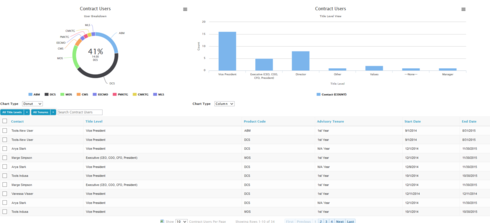
From our sandbox with some Game of Thrones/Simpsons clients:

Would love if the sorting of the categories would match SFDC sort order. Example: Title level should start with Executives, then go to VP, Director, Manager. I’m not sure how it’s sorted here but why not match how regular SFDC sorting is set based on the field? Product code should be alphabetical. Makes things easier to read if it wasn’t so random.
Hey Irvin … what component are you using to do those totals on the left? Are they just templates with some CSS?
Hi Glenn,
Yes, that’s correct. I provided the instructions in this post:
Table row drawer remain open on Field Set Save
Let me know if this makes sense.
Nice idea, I like it. Simple and effective.
Joe, your sort order idea is a good one. For Picklist fields this is how things should work. We may need to end up implementing some secondary sort capabilities within the visualization code. Having the table and the charts listening to the same models is super powerful, but often you want them sorted in different ways.
I have the order of the Title Level set in the setup but it doesn’t appear that way on the chart. I’m not sure where the “Values” and “other” options come from either.
When can I “responsibly” install superbank into my production org? I am too excited to wait much longer.
Well, we don’t consider the package to be completely clean yet, so you may get some unexpected resultls. But if you are willing to accept the risk, and play along as we release patch versions (keeping your org updated), we’d say “Go ahead”
Our reccomendation would be to install in a sandbox first, and spin through your pages to make sure core functionality is working before upgrading your production instance. But as small as you guys are, you may not have a sandbox…
We went for it … and our now live in production with RC3. So far, so good - my testing so far shows it’s working great on our Community site (a customer support portal in our case), and our internal pages (support and sales). But of course, tomorrow will be our first live day with everybody using it, so fingers crossed…!
Fingers crossed right there with you… Glad things are looking good so far for you.


