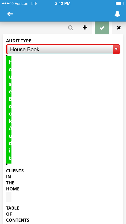
I am using conditional rendering in the mobile app to dynamically build out a form based on the picklist value selected. I have the conditional rendering added to the “Division” so all fields withing the division appear together. When I use the picklist to select the value the conditional rendering works correctly BUT it squishes the division and all the fields into 10% of the screen. The same behavior can be seen if you Preview the page in a web browser. In a web browser, however, you can resize the browser and the division will snap back to take up the whole screen. On the phone though there is no way to resize the screen.
I did just discover if select the value in the picklist and it renders incorrectly I can switch it to a non-rendering value and then change it back and then the whole division renders in the full screen. But I can’t tell my end users that. Please let me know if there is a known fix. As always, I appreciate the help and the awesome product.
Thanks!
Rich
Here is a screen shot of the division being squished into the left side.
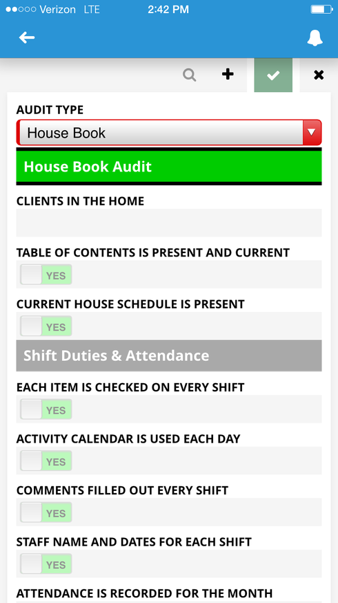
If I unselect the field that causes the conditional render and then select it again the division renders correctly. (See Below)
Any ideas on getting it to render correctly the first time?
This is probably the same issue. https://community.skuid.com/t/mobile-conditional-rendering-container-widths Let me play with adding another action and see what I can do to trick it into showing correctly.
RIch. I’ve reproduced your issue and will report it. However, if you put a wrapper component in between the division and the fields, and then do your conditional rendering on that wrapper - it seems to work correctly.
That did the trick, thank you Rob!
Reply
Enter your E-mail address. We'll send you an e-mail with instructions to reset your password.


