I have an object with 12 custom fields denoting each of the months. I was wondering is it possible to create a line graph that would show each of those 12 fields as points on the x axis, while displaying the value range as the y axis?
You can use the graph and a date field to accomplish this without a custom field.
The 12 custom fields are preexisting and used by other processes, so that’s kind of what I have to work with.
For example lets assume it’s a user record and I have 12 fields for sales (one for each month). Is there a way to construct a proper line graph from that in skuid?
Is there a way to build my data points in javascript for this? If there is I could just manually construct the 12 points I need from each record.
It sounds like you’re aggregating some data onto a user record, then want to chart that aggregated data.
Skuid makes this sort of thing pretty simple compared to SF. If you wanted to see won opportunities by owner, you’d create a model with the opportunity object, use conditions to get the won opps, and group by owner and the calendar month of the created date (or whatever date you want to use). Use this model to create a chart and you’ll have data graphed by month and user.
Thanks for the reply Josh, but my needs are a little different than that. I have a single record that contains all of my data already. User was just the object I used to describe my situation.
My actual object is a representation of an customer, and we have 12 individual fields on the record that each show a value for a particular month of the year. I want to make a January - December line graph out of those values.
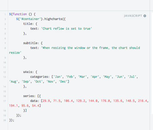
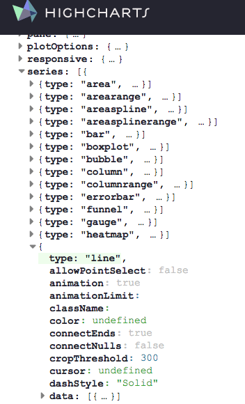
Ok, still need help with this one. I’ve gone the HighCharts direction so I could define my data in javascript since my requirement makes standard charting an impossibility (as far as I can tell). I have the chart rendering it’s legend, but no data points show up.
Can anyone help me identify what is wrong with this guy?
var $ = skuid.$;
$(document.body).one('pageload',function(){
var myModelRows = skuid.$M('mymodel').getRows();
var chartSeries = ;
for(var index = 0; index < myModelRows.length; index++) {
var rowData = buildRowData(myModelRowsRindex]); console.log(rowData.split(","));
chartSeriesrindex] = {
name: myModelRowsRindex].Account_Number__c,
data: rowData.split(",") };
}
console.log(chartSeries);
var chart = $('#container').highcharts({
xAxis: { categories: e'Jan', 'Feb', 'Mar', 'Apr', 'May', 'Jun', 'Jul', 'Aug', 'Sep', 'Oct', 'Nov', 'Dec'] },
yAxis: { ceiling: 100, floor: 0 },
plotOptions: { series: { type: "line", allowPointSelect: true } },
series: chartSeries }); });
function buildRowData(dataRow) {
var data = dataRow.Jan__c + "," + dataRow.Feb__c + "," + dataRow.Mar__c + "," + dataRow.Apr__c + "," + dataRow.May__c + "," + dataRow.Jun__c + "," + dataRow.Jul__c + "," + dataRow.Aug__c + "," + dataRow.Sept__c + "," + dataRow.Oct__c + "," + dataRow.Nov__c + "," + dataRow.Dec__c; return data;
}
I’m not a code expert, Jerry, and am having trouble deciphering exactly what you’re doing without the full xml of the page…but it looks like you need to push your data into the chart once you’ve created the data series via a series: { data: {…],} call. 
I have looked at that documentation, and the code sample you’ve provided looks very similar to what I have. I think my problem is in how I create the ‘data:’. But, I’m not sure.
$(document.body).one('pageload',function(){ var myModelRows = skuid.$M('mymodel').getRows();

 var chartSeries = e];

 for(var index = 0; index < myModelRows.length; index++) {

 var rowData = buildRowData(myModelRowsoindex]);

 console.log(rowData.split(","));

 chartSeriesrindex] = {

 name: myModelRowsoindex].Account_Number__c,

 data: rowData.split(",")

 };

 }

 console.log(chartSeries);

 var chart = $('#container').highcharts({

 xAxis: {

 categories: g'Jan', 'Feb', 'Mar', 'Apr', 'May', 'Jun', 'Jul', 'Aug', 'Sep', 'Oct', 'Nov', 'Dec']

 },

 yAxis: {

 ceiling: 100,

 floor: 0

 },

 plotOptions: {

 series: {

 type: "line",

 allowPointSelect: true

 }

 },

 series: chartSeries

 });

 function buildRowData(dataRow) {

 var data =

 dataRow.Jan__c + "," +

 dataRow.Feb__c + "," +

 dataRow.Mar__c + "," +

 dataRow.Apr__c + "," +

 dataRow.May__c + "," +

 dataRow.Jun__c + "," +

 dataRow.Jul__c + "," +

 dataRow.Aug__c + "," +

 dataRow.Sept__c + "," +

 dataRow.Oct__c + "," +

 dataRow.Nov__c + "," +

 dataRow.Dec__c;

 return data;

 }

});
There really isn’t much to the xml outside of this pageload function.
Could you use an Aggregate model to group your data on the 12 fields, then aggregate what data you want to display in the agg fields (account id count, opp amount sum, etc)?
Then for the chart: on the category axis use your grouping field (the 12) and for the Series use your aggregate data.
This is all very hypothetical, but would that work?
Thanks for the idea Jacob. I have actually come up for a solution to this and posted it on a related question here.
https://community.skuid.com/t/is-there-a-way-to-set-the-unique-id-of-a-page-component-in-…
The issue I had was that I didn’t want a graph that compared a single value across multiple records. What I needed was a graph for a single record that just displayed all 12 records as they represented the same thing.
Enter your E-mail address. We'll send you an e-mail with instructions to reset your password.


