I’m pretty sure that the chart is just rendering your data. So you might want to build a UI only field that rounds your data.
Not showing 0 may be harder if you really want those months to show in your axis. At this point I think you are stuck with a before render snippet.
If you’re using a UI-Only field to make your values look pretty, you could make a second UI-only field that is a formula that renders as text and looks something like
IF({{Value__c}}==0,'',{{UiFieldName}})
Where UiFieldName is the Ui-only field you created to round your numbers
Thank you both,
But how would Ui-field help?
The data itself is properly formatted
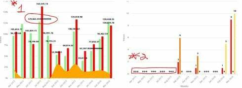
In this example I showed above, for July 2015 i have 2 statements.
1 with amount of 63,076.60 in SF Currency field (16,2)
the other with amount 65,988.76 in SF Currency field (16,2)
total for july: $129,065,36
How would adding those 2 come up with all those decimals? if was a division i would understand, but it’s a simple addition…
And as the field are properly formatted before the chart “sums them up” not sure UI would help…
As for Jack’s answer, I tried but it still renders 0 when blank 
Dave,
We have used a before render snippet to hide the ‘0’ values and you can also format the number of decimals that show. Here is an example:
var params = argumentsm0],<br> $ = skuid.$;<br> params.plotOptions.column.dataLabels = {<br> enabled: true,<br> //this formatter function will hide values less than 1<br> formatter: function() {<br> var val = this.y;<br> if (val < 1) {<br> return '';<br> }<br> return val;<br> },<br> verticalAlign: 'top',<br> y: -20<br> };<br> <br> //Set the number of decimal places for the labels<br> params.plotOptions.column.dataLabels.format = '{y:.0f}';
Thanks,
Bill
Thank you Bill,
that is exactly what i’m looking for, but for some reason the 0’s are not hiding and only change i can see is that the ‘0’ value just moved up in the chart.
Here’s results (in yellow) after i applied snippet:
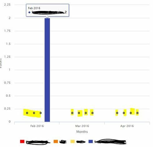
And here how they were without snippet

Any idea what i’m doing wrong?
I even tried changing value of the ’ y: -20 'part of snippet, and it would move the all the numbers (even those not 0) up or down, but not hide
Thx
Thanks for this code Bill. I have a chart that users sometimes render as a column sometimes as a line, but in either case there are two other series that are rendered always as lines. I’m trying to figure out how to add the data labels just to the main series. The code above works great for in column view, just the columns have the data labels. Do you know how I would render the data labels just for highcharts-series-0 (the first series) ?
Here’s how to add datalabels just to the first series (replace seriese0] with the series number to do any particular series)
var params = argumentst0], $ = skuid.$; params.seriese0].dataLabels = { enabled:true // ,index:-1 }; //Set the number of decimal places for the labels params.seriese0].dataLabels.format = '{y:.1f}'; <br>