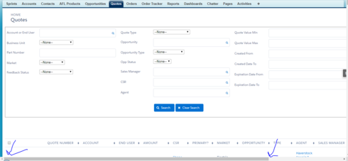
In classic a tab page with the Lightning Design theme has a left/right scroll bar at bottom as soon as the page opens as seen here:
In Lightning the same tab page when opened, there is no left/right scroll bar at bottom as seen here:
!(https://us.v-cdn.net/6032350/uploads/attachments/RackMultipart20180410-83598-rk4x58-Lightning_Design_theme_tab_in_Lightning 1 inline.PNG “Image https//d2r1vs3d9006apcloudfrontnet/s3_images/1723826/RackMultipart20180410-83598-rk4x58-Lightning_Design_theme_tab_in_Lightning__1__inlinePNG1523366517”)
If you scroll all the way down to the bottom of the page, a very tiny bar appears but it is very difficult to see and use.
!(https://us.v-cdn.net/6032350/uploads/attachments/RackMultipart20180410-57547-3b0teq-Lightning_Design_theme_tab_in_Lightning 2 inline.PNG “Image: https://d2r1vs3d9006ap.cloudfront.net/s3\_images/1723827/RackMultipart20180410-57547-3b0teq-Lightning\_Design\_theme\_tab\_in\_Lightning\_\_2\_\_inline.PNG?1523366526”)
Is this something that can be fixed int he Lightning Design theme?

