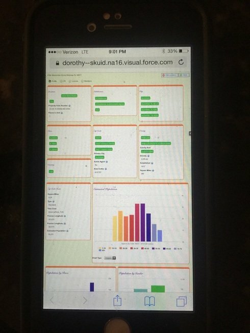
any ideas
Hey, Bill, try setting the min widths of your grid divisions to be larger and see if it starts wrapping sooner.
(Also it doesn’t look like it, but if you happened to have the Salesforce Header enabled on a page, that sets a rather large min width for your page, which will keep your divisions from wrapping unless their combined width is wider than the Salesforce header, if that makes sense.)
Thanks Anna, I changed the size and it did nothing. I have no headers. Here is the desktop view.

Here is an iphone 6. It should only show one row as I have the min size set to 350px.
Any thoughts?
From your screenshots it does appear that the responsive grid is responding, since it goes from 6 divisions across on desktop to 3 divisions across on mobile.
My recommendation is to try increasing the min size of your divisions and maybe experiment with other measurements (percents? em?) until the divisions wrap how you want them to.
Do you change the division size?
Or do you change the Wrapper size?
Change division size - although your wrapper width should not be larger than your min division width, I think in that case the wrapper would win out, but I’m not sure.
Another way to do it would be to have your division behavior be “fit to content” and then specify the width in the wrapper
I did change to “fit to content” Set the min and max for the width of the wrapper, but the wrapper never gets larger than the minimum size. It also does not adjust to a correct with on the iphone. I have seen you resize the screen on a desk top
Okay, so if you want the wrapper size to change, then I believe the best way to handle this is through the responsive grid: so go ahead remove the width settings from your wrapper, and then change your grid division back to flexible behavior, and set the minimum width (again, it may take some experimenting to find the ideal minimum width for your divisions so they wrap the way you want them to).
Bill, did you ever get this to work? I’m running into the same issue. In a desktop browser, everything wraps as expected if I just shrink the window size down, but on the iphone it doesn’t wrap at all.
Was not resolved.
I just saw this. I think the issue is that your page (on mobile devices) needs to have the right viewport settings in the header. You have to use the Skuid component method to bring Skuid into your page, and then include the following line of code above your skuid component.
<meta name="viewport" content="width=device-width, initial-scale=1, user-scalable=no, maximum-scale=1"></meta>
So, your final page would look something like this...
The meta tag here instructs your device's browser that it should never zoom out to see content. Let me know if this fixes the issue.
Never done this before. Can you shoot a video on how to or send the steps on where to copy this code.
Paste the code into a Visualforce Page that has the skuid page… it looks like from your example above you are just previewing the page or using the page link that comes from previewing page, i.e. using skuid’s skuid__ui page.
If you haven’t already, you’ll need to create a new Visualforce page and paste in the code Ben has above, replacing “mypage” with your skuid page name, e.g. “R_Detail_Location”. Make sure you check the box that says available for mobile when you are editing that Visualforce page.
Then your page link would be /apex/newVFpagename instead of /apex/skuid__ui?page=skuidpagename
If you want it available in Salesforce1 app, you can go to Tabs and create a new Visualforce tab. Because you marked your page available for mobile, you can find that new tab in the Salesforce1 navigation setup.
Reply
Enter your E-mail address. We'll send you an e-mail with instructions to reset your password.

