Hi,
We have a requirement to replicate a salesforce report in skuid charts. this report basically calculates the opportunity amount and divides the result with number of records. Report grouping is on account id. i am able to get the sum of opportunity amount as well as row count based on account grouping. however, i am unable to perform the calculations. any pointers will be helpful.
thanks
You can add a ui-only formula field to your model to do the calculation.
thanks Matt. I already have the formula field in place. however, chart doesn’t retain the ui-only formula field in category field dropdown.
I’m not following. Can you post some pictures or video to show what you mean and what you want?
here is the model and chart code.
LAST_N_QUARTERS:4
THIS_QUARTER
Void
Suspended
<skuidvis__chart model=“NewBusinessHitRatio” maintitle=“New Business Hit Ratio” type=“line” uniqueid=“sk-r7kSK-317” subtitle=“Rolling Four Qtrs” rendersnippet=“” height=“300px”>
column
bar
</skuidvis__chart>
some differences in aggregation due to change in requirement from report.
Consider Salesforce roll up fields to aggregate the values of opportunities and count the number of records, then a Salesforce Calc field to do the math. Then bring the three fields into your Skuid model and chart them.
Thanks Raymond. I deleted my previous comment as i just checked that rollup summary fields won’t support dynamic date filters. so back to square one.
Sunny~
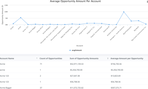
Is this what you are trying to do: a chart that shows, by account, the average $ value of their opportunities?

If so, here is what you need to do:
Create an aggregate model. Really, you only need the first aggregation, the other 2 are for the table on the bottom of my screenshot above that confirms the calculations.
Since I want it by account, I grouped it by account ID.
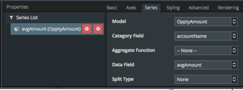
I decided to use a line graph but you can use whatever type suits your fancy.
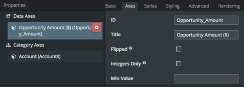
You can use whatever you feel best describes the axes of your chart. Here’s what I used.
Drag in whatever data you would like. If you want to make it more descriptive, you could even have a second line graph on top of this that shows the number of opportunities per account.
Hope this works for you! Post back if you have any questions about this.
Thanks!
Karen
Thanks Karen for your response but unfortunately this is not something i am looking for. this is something i am looking for:
For opportunity, we have 2 fields. let’s say field A and field B. Broker field is custom lookup relationship between Account and Opportunity.
For a broker, for each quarter, i want to show sum of Field A and field B divided by number of opportunities.
Data limitation is for last 4 quarter and current quarter. Since it is a lookup relationship, rollup summary won’t work (moreover, filter logic won’t work as well).
i am getting row count, sum of field A, sum of field B. what next? I tried some snippets from this forum, but they don’t work.
Any thoughts on this?
Sunny,
It’s still not clear to me what isn’t working. The formula field that you have in your original model looks fine (although you probably want to multiply by 100):
<field id="CalcPercentage" uionly="true" displaytype="PERCENT" label="({{{sumDBGBoundCalcc}}}+{{{sumAIGCIBookedCalcc}}})/{{{countId}}}" precision="10" scale="2"/>
What do you mean by:
chart doesn't retain the ui-only formula field in category field dropdown.?
CalCPercentage: ({{{sumDBGBoundCalcc}}}+{{{sumAIGCIBookedCalcc}}})/{{{countId}}}
Using CalcPercentage in data field and saved successfully. However, when i refresh skuid edit page it automatically CalcPercentage is replaced by other aggregated field.
Enter your E-mail address. We'll send you an e-mail with instructions to reset your password.

