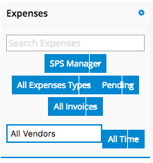
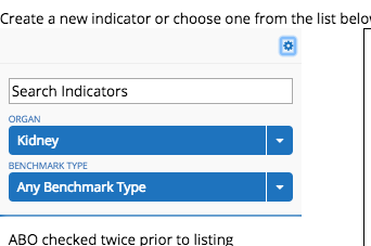
These filters on the Queue used to work properly with each stacked on top of each other. They are on top of each other and the title seems to flow into the down arrow section.

These filters on the Queue used to work properly with each stacked on top of each other. They are on top of each other and the title seems to flow into the down arrow section.

I tried updating the themes to see if this corrected it, but alas this didn’t do anything.
Same problem here.
Anyone figure out what’s going on here?
Chelsea, Pat, Chandra, Adam - we recently released Brooklyn Update 1, Iteration 3, which contains some fixes for filter overlap and alignment issues. I’m not sure of the nature or scope of each of your issues, but I’d still recommend trying this new version out in a non-business critical sandbox, as there were several related issues that were addressed.
Brooklyn U1 Iteration 3 is now available on the Skuid Releases page.
As a reminder, Salesforce does NOT allow reverting back to prior versions of managed packages. Skuid always recommends installing new versions in a non-business critical sandbox environment to test all mission critical functionality before installing into a production environment. We also recommend that you update out of date themes when you upgrade.
Mark, thank you for the quick reply! I will give this a go in our sandbox.
I found this still to be not working in release 9.5.4
I used the following css class to fix it:
.nx-queue-settings div.nx-actionselect.nx-conditiontoken {display: block;}
.nx-queue-settings .nx-conditioncontainer {text-align:left;}
I wasn’t able to define a unique class and apply that to the queue, and if you don’t add .nx-queue-settings to the front it will apply this to all table filters on your page, but the above seemed to work for me, makes each filter span the width of the queue:

Hi Jack. The workaround you’ve shared is definitely appreciated. The fix wasn’t ready for this week’s maintenance release, but this issue is definitely on our roadmap.
In case stretching the filters to 100% of the queue’s width doesn’t fit a page’s design, I had also posted the following workaround on another Community post about the issue:
If you are looking for a way to try and work around this in the short term, you might try adding an inline CSS snippet to your page like this:
.nx-actionselect-dropdown-item { <br>padding-right:50px;<br>}
which pads the right hand side of the dropdown’s text. Feel free to adjust the 50-pixel value if you need, and be sure to check that it doesn’t have any unintended effects on other page elements (I don’t believe it will). Once you update to a version of Skuid that has this issue fixed, you’d want to delete the CSS snippet.
Enter your E-mail address. We'll send you an e-mail with instructions to reset your password.