Hey All,
I am new to Skuid (~2 weeks experience now). My company uses it heavily in Salesforce, but I have an issue/question that has exceeded our knowledge.
My requirement is to make a drop down button that combines three buttons. All of these existing buttons are contained in a Page Title component along with several other buttons that will remain unchanged. Each button launches a workflow via a JS Snippet.
I didn’t find a straightforward way to create a drop down button (if you know of one compared to what I’ve done (described below), please enlighten me!). So here is what I have done:
- I created a custom model. In this model > created a picklist field > created and action (when row in model updated, then run 3 actions).
- In the action, I have three branches. Each branch has logic that says: if the model == ‘selection1’, run this Snippet. This all works well.
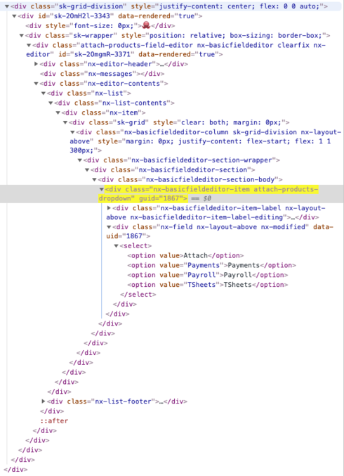
- To insert this ‘button’ in our existing page, I placed it next to the Page Title component holding the other buttons. It is in as such: Division>Wrapper>Field Editor>Column>Picklist
But I have three things that I just can’t seem to override with my CSS (even using !important). Those three things are Border Radius, the two arrows on the right of the button (we would prefer one down arrow or none at all), and the alignment of the text. None of these are deal breakers to the folks that will approve this, but it would be cool to be able to match this perfectly or know why I can’t.
Concerning the below CSS, you will notice that I had to really ‘get in there’ to get things to change. Applying CSS to the attach-products-dropdown class doesn’t affect much. I have tried going up and down the chain of divs with no luck. There is a CSS class for the Field Editor too, but that hasn’t helped.
If you have any ideas, please let me know. Thanks!
CSS:
.attach-products-dropdown div:nth-child(2) > select {
cursor: pointer;
cursor: hand;
background-image:
linear-gradient(#FFFFFF, #F2F2F2);
border: 1px solid #DCDCDC;
border-radius: 2px !important;
font-size: 14px;
font-family: SalesForce Sans;
color: #393A3D;
text-align: right;
width: 90px;
height: 34px;
padding-left: 18px;
padding-right: 16px;
margin-left: -14px;
margin-bottom: 1px;
}
The ‘Attach’ button is what I have styled with the above CSS.

So many divs…
That’s all I got. Thanks again!


 I’m sorry to see that your post remained unanswered for a while. I was wondering if you found a solution for your question in the meantime. If not, please respond to the following: