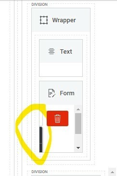
Most of the pages I work with have a few layers of responsive grids, wrappers, wizards, etc. that sometimes make it difficult to select the item in the composer that I need to work on. In Spark, there’s a lot more granular control and I’m finding that this is naturally leading to even more layering. Generally speaking I see this level of control and page hierarchy a positive, but the page composer is much more difficult in spark for these nested structures. Also, the component layout frames seem to take up slightly more real estate and the horizontal scroll is no longer there.
The idea I have to solve for this would be to have some sort of zoom in to drill down or popup for the section of components that need to be worked on.
Here’s a screenshot of the issue in the Spark composer where I can’t add a field to a form component::


