I’m getting some very strange CSS injections into standard Salesforce CSS on my opp detail page. I’m not exactly sure when this started happening, but it seemed to be about the time I added an inline CSS for the first time. However, it doesn’t go away when I delete that CSS snippet.


The issues are with the sidebar and the app menu.


It seems like this wouldn’t be a skuid issue because it’s in the Salesforce CSS files, but it’s only happening on this one Skuid page, so I thought maybe somebody here could help.


Here’s how my sidebar looks, there’s a gray background, and all kinds of extra style on the Create New button that isn’t supposed to be there.


Here’s the CSS line that is making the gray background, when I uncheck it things look right.
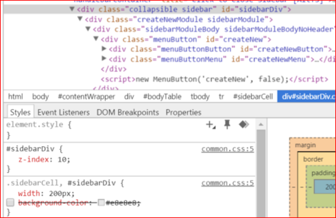


Here’s the CSS that is making the Create New button look funky, some particular #createnew version of the .menuButtonButton class, when cross all those out things look right.
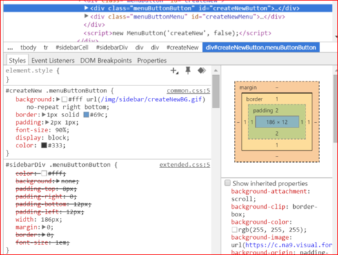

Here’s what the CSS should look like:
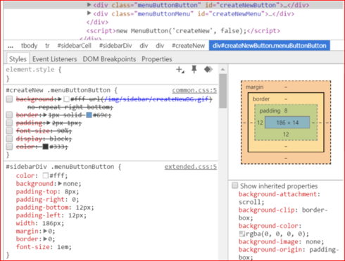

Here’s what the funkiness with the app menu looks like:
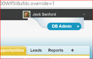

Here’s the CSS at work:
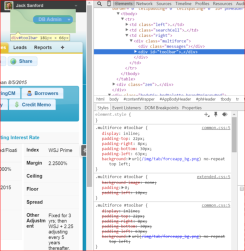

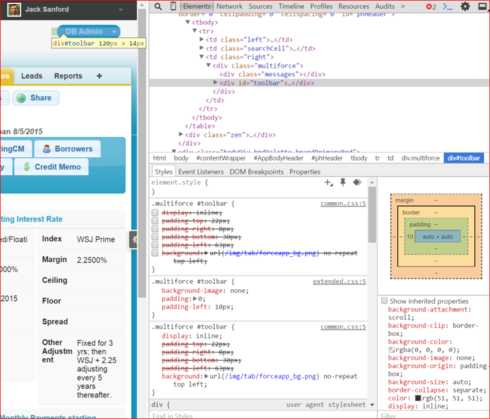
When I cross out the lines on the first .multiforce #toolbar section everything looks fine:
What happens when you try a different browser?


Looks the same in Firefox and IE


Any idea why this is happening? In Sandbox and production, every time I use custom CSS on any Skuid page. It’s getting out of hand.


Do you happen to have a chatter news feed on your page? If you remove the news feed do the styling issues go away?


Some pages do and some pages don’t, the chatter feed doesn’t seem to affect it. What affects it is having any custom CSS snippets on the page


Jack, that’s really strange, it looks like the standard Salesforce CSS is getting loaded in twice. The only time I’ve seen this is in cases where the Skuid Social component is being used and set to “newsfeed”. Is your custom CSS set up as an inline resource or as a static resource? If it’s only a small amount of CSS can you post it here?


I don’t even know what the Skuid Social component is… :) 

All my CSS is inline, and it’s different on different pages. But anytime I’ve got any custom CSS it does it. 

Here’s a few examples:

Title Team Dashboard + HomePage


.box{ padding: 8px; background-color: LightBlue; border-width: 2px; border-color: Navy; height: 75px;         margin: 4px; position: relative; } .bottomtext { text-decoration:underline; position: absolute; bottom: 8px; width: 100%; text-align: left; }

MatterView


.shortPanel {min-height:20px; }

OppDetail


.templatesummary {margin: -30px 0 20px 40px;} 

Opp New


&#46;widePicklist select {max-width: 100%;<br />}<br />&#46;shortPanel {min-height:20px;&nbsp;<br />}

We had this happen in the past and found that adding an !Important tag to the CSS code seemed to resolve things.


Hi Jack,

That is really strange. If you wouldn’t mind, could you grant Skuid access to your org following the instructions below so I can take a look?

http://help.skuidify.com/m/getting-started/l/182412-getting-help-how-to-grant-skuid-login-rights-to-…


Done. Do you need the Org ID?


FYI, I just added !important to all the attributes in all the CSS of the Title Team Dashboard and it’s still doing that. 


Yeah, if you can email the org id and the name of a page that is exhibiting the issue to support@skuidify.com, I’ll take a look.


Hi Jack,

This looks like a confusion of terminology. Internally and in the Skuid code, we call the “Chatter Feed” component, the “Social” component. So when I was saying “Social” I should have been saying “Chatter Feed”.

From looking at your org, this does seem to be the issue with the Chatter news feed causing standard Salesforce styles to be loaded in twice. Each one of these pages has a Chatter tab, and in that tab is a “Chatter Feed” component. These “Chatter Feed” components have a “Feed Type” property of “News Feed for Running User”. If you remove the “Chatter Feed” component from those tabs, the issue should go away. I don’t think this has anything to do with custom CSS.

Right now, the only workaround I can think of (if you still want to keep the chatter news feeds on every page) would be to put those feeds into an iframe using a template component.

Really, though, I’m not sure why you would want a news feed for the current user on each of those pages. If you change the “Feed Type” property to “Feed for Model’s First Row” the issue should go away, and your chatter feed will actually be in the context of the object you’re viewing instead of just the news feed for the user.

Does that make sense?


Hi Ben,

Thanks for taking a look. You’re right, taking off the chatter feed worked on the Title Team Dashboard, where it was set to Feed for running user. It would be nice to have that on the page, as that acts like a sort of home page for title team users. 

The other two pages where the CSS is messed up that have Chatter Feeds, the components are set to Feed for Model’s First Row, and have always been set that way. We really need those feeds, too. 

Also, we have other pages that have Chatter Feeds that are set to Feed for Model’s First Row that don’t do the funky CSS.

… turns out it’s the Show Followers thing - if you uncheck that it causes the CSS break even if the Chatter is set to Feed for Model’s First Row. Checking that fixed the problem.  


Cool, well at least we were able to figure out what was going on. I think there will probably be one more Superbank patch sometime that would fix this, but I’m not sure when. I do know that this is fixed in Banzai though.


Reply