I have an aggregate model that takes the number of Events a sales rep creates and averages it - avg per week over a 4-week period.
Everything’s awesome…except for the part where there is now a category labeled “null”, which I’ve figured out is taking the average for the entire team (adding all Events and dividing by 4). In theory, this could maybe be nice for a manager, but A) no one’s going to know that when it’s labeled “null” and ") it’s skewing my graph so all the reps’ values look like ants next to an elephant.
it’s skewing my graph so all the reps’ values look like ants next to an elephant.
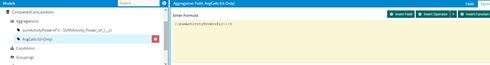
This my field/formula:
This is my chart series: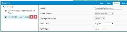
And this is the result: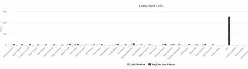
I’m still learning/playing with aggregate models and charting, so I’m hoping I just forgot something/missed a step.