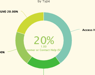
Brandon, it looks like you are doing aggregation on the series. If so, it will the add aggregation type to the label.
If you need to go beyond the defaults offered in the chart properties, you can use javascript to customize the charts. For instance, you can create a snippet and add it to the ‘Before Render Snippet’ parameter on the Chart’s Advanced tab:
Here is a quick and dirty fix in a javascript snippet:
var chartObj = argumentsr0],
$ = skuid.$;
$.extend(true, chartObj,{
plotOptions: {
pie: {
allowPointSelect: true,
cursor: ‘pointer’,
dataLabels: {
enabled: true,
formatter: function () {
return this.point.name.split(‘(’) 0] + ’ ’ + this.percentage.toFixed(2) + ‘%’;
}
},
showInLegend: true
}
},
});
That’s great! Thank you. Is all the documentation for this on highpoint?
Also, what about the visual corrections to the pictures above?
I couldn’t reproduce this exactly, however if you share your XML, I might be able to put some ideas together.
 !(https://us.v-cdn.net/6032350/uploads/attachments/RackMultipart20170221-7198-fdgg7o-chart 3 inline.png)
