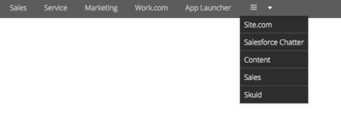
Nav component items display as three lines with no label sometimes on page load. Doesn’t seem to have a pattern. Once clicked, the icon and label appear. Screenshots attached.

I’m having a difficult time reproducing what you are seeing. Do you have a simple reproduction page without custom objects that you wouldn’t mind copying over the XML for us?
Raymond~
Is this what you are talking about with the 3 lines in the nav component?
Here is what I see if my nav component is allowed to take the full width of the Skuid page.
Here is what I see if the nav component is the 2nd of 3 divisions of a responsive grid. Due to a lack of space in the division, it’s changing to the 3 lines so I can see the rest of the options.
Thanks!
Karen
Yes! That is what I am seeing, however, it only happens maybe once every ten page loads and when you click on the nav item, it expands out to a normal nav item and works normally from that point on. It is not a space issue, however, they are in “fit to content” responsive grids.
Here is xml that demonstrates the problem. In this scenario, the nav’s work on page load, but then if you click the “other tab” in the tab set then click back to the first tab in the tab set, the navs load with 3 lines. If you click them, they expand back out with the labels and icons.
 
Raymond, I think a bit of your XML was truncated unfortunately.
Try this:
<p style="text-align: center;"><span style="font-size:22px;">Sample Stuff Here</span></p>
Hi Raymond, thank you for this reproduction page. I’ve found that two settings appear to be necessary to cause this visual issue:
1) Unchecking the Overflow to Menu Navigation option on any of your 4 navigation items causes that icon to remain loaded while switching between tabs. It would also affect how responsive the navigation menus are, of course.
2) Unchecking Defer rendering of tab contents on your tab component allows the icons to show correctly after switching tabs. Having this unchecked can affect page load time, and so is not the recommended setting, but it may help you in getting the icons to behave as expected.
Both of the above settings should normally be checked for most applications, so I will submit this as a product issue to our development team, and we will update this post when a fix is available.
Great, thanks!
Hello Skuid Community ~
This has been addressed in the new Millau 11.2.6 release which is now available on the Skuid Releases page.
As a reminder, Salesforce does NOT allow reverting back to prior versions of managed packages. Skuid always recommends installing new versions in a non-business critical sandbox environment to test all mission critical functionality before installing into a production environment. We also recommend that you update out of date themes when you upgrade.
Reply
Enter your E-mail address. We'll send you an e-mail with instructions to reset your password.

