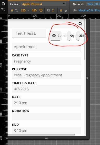
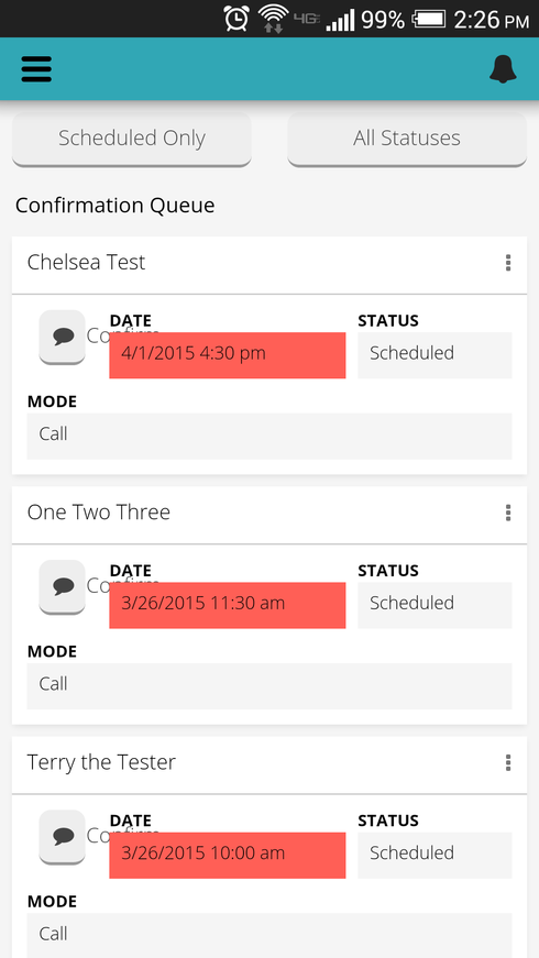
Buttons look great on initial page load, but after setting the main panel to something else, and setting the main panel back to the first page again, I get this:


The text on the small “Confirm” buttons is running over into the next field.


This happens in the chrome dev console mobile testing space, as well as on my phone as pictured above.

Matt,  what kind of device are you testing this on?   I cannot reproduce this issue. 

The responsive effects on buttons should remove the text and leave only the button as the space available for the division shrinks.  


Rob,

Happens when testing in Chrome (using apple iphone 4 or 5 size) and on my HTC One.

I have the min division width set to 50.


I’m seeing it on this page as well, but it happens every time (on initial page load).


Perhaps It’s related to the fact that even the icons don’t fit on the buttons?


Any ideas on this one? My buttons are consistently failing to contain their text.


Matt,

I tried to have a look at this issue, but I’m having trouble replicating it. I’ve still got access to your Org. Would you mind sending support@skuidify.com steps to reproduce? Thanks.


Reply