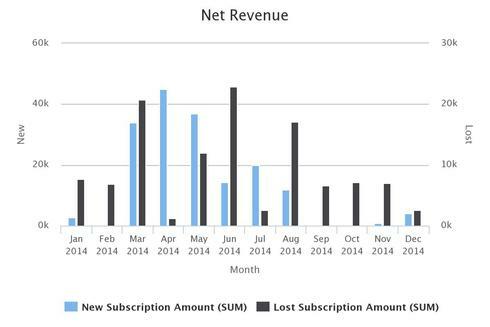
I am working on a chart that shows our new subscriptions and lost subscriptions by month on a column chart. New Subscriptions and Lost Subscriptions are two different models.
I was able to get the two models on the same chart, but as you can see in the sample data below, the issue is that the max value for the two axes is different. So at a glance it looks like June’s lost subscriptions are more than double the new subscriptions.
I am able to remedy this by manually setting the max value for both axes to the same amount. However, that goes out the window if I want to change the groupings to calendar quarter or year instead of month.
My question: Is it possible to dynamically default my lost axes to the same defaulted value of my New axes? So in the example below, the Lost axes would default to a max of 60k. If I changed the grouping to year and New went up to a max of 500k, Lost would follow suit.

Thanks in advance for any direction you can provide!
Page 1 / 1
Adam,
Is there a reason why you want to display them on two different axes? If you associate both series with the same axis and they’ll use the same scale.
I think I was over thinking it.  Thanks for your quick reply!
Sure thing! Glad you got it sorted.
Enter your E-mail address. We'll send you an e-mail with instructions to reset your password.

