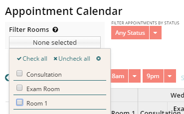
Any jquery/css wizards want to take a crack at this one?
The quick answer to your question is NO. We are not aware of anyone who has gotten both multipicklist controls to look exactly the same.
But Matt’s challenge still stands. Any jquery/css wizards out there? I bet an offer for tacos would stand…
How about a donut? We’ve got an awesome little doughnut shop here in Rochester called Ridge Donuts, each doughnut easily twice the size as a standard Dunkin. Doughnut of your choice, baked fresh and shipped the same day!
Hi Matt
I found the idea quite cool, so I first tried to do it with JQuery. But somehow couldn’t get it to work. With CSS it finally worked.
For the dropdown arrow, I took a FontAwesome Icon:
.ui-multiselect::after{<br> font-family:fontAwesome !important;<br> content:'f0d7';<br> color:white;<br> padding-left: 0.5em;<br>}
Rest of the CSS:
.ui-multiselect{<br> white-space:nowrap;<br> color:white !important;<br>}<br><br>.ui-multiselect span{<br> color:white;<br> padding: 0px 10px 0 0;<br>}<br><br>.ui-multiselect-checkboxes label input{<br> display:none;<br>}<br><br>.ui-multiselect-menu.ui-widget-content{<br> padding:0;<br>}<br><br>div.ui-multiselect{<br> background:#0288d1;<br>}<br><br>.ui-multiselect-menu.ui-widget.ui-widget-content.ui-corner-all ul{<br> height:inherit !important;<br> background:#0288d1;<br>}<br><br>.ui-multiselect-menu{<br> width:9.2%;<br>}<br><br>.ui-widget-header{<br> display:none;<br>}<br><br>.ui-multiselect-checkboxes.ui-helper-reset li label:hover{<br> cursor:pointer;<br> color: rgba(255,255,255,.85);<br>}<br><br>.ui-multiselect-checkboxes.ui-helper-reset li{<br> color:#fff;<br> border-bottom: 1px solid #0298ea;<br>}
The field has a column width of 10%.
Play a little bit with the colors, this code fits for the default theme.
Cheers
Nice work, JG!
I added some additional CSS for the background, label, and some additional spacing (and added my field editor’s unique id to all of yours CSS). I had to change the font size. Apparently the font size for filters on the table component is slightly smaller than the font size for the page.
Here’s the image:

Here’s the updated CSS:
#roomsFilter .ui-multiselect::after{

    font-family:fontAwesome !important;

    content:'f0d7';

    color:white;

}

#roomsFilter .ui-multiselect{

    white-space:nowrap;

    color:white !important;

}

#roomsFilter .ui-multiselect span{

    color:white;

    padding: 0 8px 0 0;

}

#roomsFilter .ui-multiselect-checkboxes label input{

    display:none;

}

#roomsFilter .ui-multiselect-menu.ui-widget-content{

    padding:0;

}

#roomsFilter div.ui-multiselect{

    background:#f58378;

    padding: 5px 8px;

    border:none;

}

#roomsFilter .ui-multiselect-menu.ui-widget.ui-widget-content.ui-corner-all ul{

    height:inherit !important;

    background:#f58378;

}

#roomsFilter ui-multiselect-menu{

    width:9.2%;

}

#roomsFilter .ui-widget-header{

    display:none;

}

#roomsFilter ui-multiselect-checkboxes.ui-helper-reset li label:hover{

    cursor:pointer;

    color: rgba(255,255,255,.85);

}

#roomsFilter .ui-multiselect-checkboxes.ui-helper-reset li{

    color:#fff;

    border-bottom: 1px solid #0298ea;

}

#roomsFilter .nx-editor-contents {

    margin-top: 8px;

}

#roomsFilter .nx-basicfieldeditor-item {

    border-bottom: none;

    background-color: transparent;

    font-size:.91em;

}

#roomsFilter .nx-basicfieldeditor-item-label.nx-layout-above {

    position: absolute;

    top: -6px;

    font-weight: normal;

    font-size: .7em;

    text-transform: uppercase;

    word-wrap: break-word;

    padding: 6px 0 0 0;

}
Text me your address and the doughnut of your choice: 585.500.7681 
Note for posterity: I have the multiselect field in it’s own field editor, in the div of a responsive grid which is set to Fit Contents. Works very smoothly.
I’m not quite sure if they’ll ship to Switzerland. 


