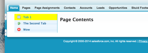
When using a right or left tabset, the default behavior is to highlight the other tab instead of the tab that the user is looking at. Is there a way to reverse that behavior, so that the current tab will be highlighted instead of being the same color as the rest of the page?
Page 1 / 1
Moshe - We are reusing the UI applied to “Tabs on Top” model here, and it is not super effective. But you can override the CSS for the ‘active tab’ so that it has more differece.
You want to be careful to add a Unique ID to the Tabset so that the css you apply doesn’t affect lots of other items on your page. I used ID “LeftTabSet”
Then add a custom CSS statement that looks somthing like this:
#LeftTabSet .ui-state-active {background: yellow;}
Here is the result:

Thanks that works! I would like the color to be similar to the rest of the page, can you give me some css that would simply reverse the colors? Instead of a color that clashes with the rest of the page. Thanks
Reply
Enter your E-mail address. We'll send you an e-mail with instructions to reset your password.

