Hi Chandra,
Similar to the existing workaround you mentioned earlier in this conversation, here’s a CSS rule you can try:
.nx-field input, .nx-field textarea, .nx-field .flex-text-wrap pre, .nx-field .nx-richtext-input {
min-height: 1em !important;
max-height: 1.2em !important;
}
It looks like this issue is slightly different underneath the hood, since before, a max-height wasn’t necessary. I will surface this with our product team for further investigation.
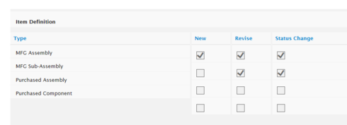
Tried to use this, but the max-height made all our text input fields get super small, and our users could not see the text they were typing in to the field.
Mark - any thing else here we can try. The above workaround caused the other issues described. So we are left with still having large check boxes.


