Do you have any custom components that have custom css on this page?
No, no custom components or any css on that page. I was able to create an easy repro.
Firefox (looks good)

Chrome (looks bad)

XML
{{Name}}
{{Model.label}}
Unfortunately, I have not been able to reproduce your problem on a mac.
Chrome: Version 54.0.2840.71
Firefox: 52.0
And on PC, I cannot reproduce on
Chrome: Version 56.0.2924.87
Edge: 38.14393.0.0
Well, I’m not sure what else to do. Just to re-cap, the page is set to Theme = Default. Our default is out of the box Classic. I changed the theme to Classic, and the problem was still there.
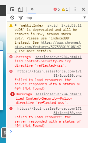
I do have these errors in the console, have no idea if they are related.

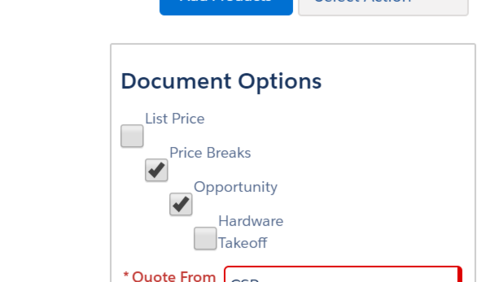
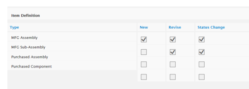
We have all users reporting this issue, on the affected browsers. Because we have this page with multiple check boxes all aligned, the big boxes make the text no longer sit next to its box.
Those are common bugs and shouldn’t change anything.
Moving this into email.
In case anyone else stumbles upon this and has the same issue:
.nx-field input,.nx-field textarea,.nx-field .flex-text-wrap pre,.nx-field .nx-richtext-input { min-height:1em; }
This CSS fix was found to help with this issue. For an unknown reason, the min-height was being set to 2.031em.
In case anyone else stumbles upon this later and has the issue update #2:
This problem was solved by upgrading to 9.5.2
FYI: just experienced this with 9.5.6 (updated today) in Chrome, Modern theme. Wasn’t experiencing this in an earlier Brooklyn version. Is it possible I need to update Out of Date Themes?
The CSS fix solved it for me.
Michael, do you see this button? If so, give it a press. Buttons love to be pressed.

Stephen,
I actually asked about this in my Post. But I’m hesitant or cautious to “update” anything. Should I have complete confidence?
I’m not sure what you mean by complete confidence. If the CSS fix solved it for you, and everything is working, why risk it?
I cannot deal in absolutes, I am jedi, not sith. Only Sith deal in absolutes.
However, I can tell you this: That “Update out of Date Themes” button hasn’t caused problems before. It’s not the same as upgrading your org. It’s very ‘low key’ in comparison. I can’t promise you that you won’t have problems, but I can say I would be surprised if you did.
Fair enough, Jedi Master.
Consider me chastised.
May the force be with you
This problem returned for us also in 9.5.6, Chrome and IE. FireFox is fine. Yes, I have clicked “Update Outdated Themes” and the issue did not resolve. As reported in this problem originally, we use a custom theme that was based off Classic.
EDIT to add: seeing it in Production on 9.5.6 and in our sandbox on 9.5.7.
Is the work around code still working? (Seen earlier on this thread)
We did not implement the work-around. We have almost 300 Skuid pages in production, so it’s tough to implement page level workarounds.
Unfortunately, I’m unable to replicate the issue in 9.5.7 or 10.0.0 
I have Millau (11.0) installed in the Sandbox and I am seeing the large checkboxes in Classic.
Same here. I am seeing this in my developer org–before and after updating my themes. This is true for all themes including Classic.
Can yall post some XML of a broken page here for me? I haven’t seen any large checkboxes yet in Millau.
Stephen,
Here is what I am seeing in my developer org when viewed through Chrome.

Here is the page xml:
<skuidpage unsavedchangeswarning="yes" personalizationmode="server" useviewportmeta="true" showsidebar="true" showheader="true" tabtooverride="Contact">

<models>

    <model id="Contact" limit="1" query="true" createrowifnonefound="false" datasource="salesforce" sobject="Contact" type="">

        <fields>

            <field id="FirstName"></field>

            <field id="LastName"></field>

            <field id="IsEmailBounced"></field>

        </fields>

        <conditions>

            <condition type="param" enclosevalueinquotes="true" operator="=" field="Id" value="id"></condition>

        </conditions>

        <actions></actions>

    </model>

</models>

<components>

    <pagetitle model="Contact" uniqueid="sk-2TMVdh-203">

        <maintitle>

            <template>{{FirstName}} {{LastName}}</template>

        </maintitle>

        <subtitle>

            <template>{{Model.label}}</template>

        </subtitle>

        <actions>

            <action type="delete" uniqueid="sk-2TMVdX-192"></action>

            <action type="clone" uniqueid="sk-2TMVda-195"></action>

            <action type="share" uniqueid="sk-2TMVdc-198"></action>

            <action type="savecancel" window="self" uniqueid="sk-2TMVdf-201"></action>

        </actions>

    </pagetitle>

    <basicfieldeditor showsavecancel="false" showheader="true" model="Contact" mode="read" uniqueid="sk-2TMVe6-222">

        <columns>

            <column width="50%">

                <sections>

                    <section title="Basics" collapsible="no">

                        <fields>

                            <field id="FirstName" uniqueid="sk-2TMVds-211"></field>

                            <field id="LastName" uniqueid="sk-2TMVdt-214"></field>

                        </fields>

                    </section>

                </sections>

            </column>

            <column width="50%">

                <sections>

                    <section title="Checkbox" collapsible="no">

                        <fields>

                            <field uniqueid="sk-2TMnAY-324" id="IsEmailBounced"></field>

                        </fields>

                    </section>

                </sections>

            </column>

        </columns>

    </basicfieldeditor>

</components>

<resources>

    <labels></labels>

    <css></css>

    <javascript></javascript>

    <actionsequences uniqueid="sk-2TMcTN-256"></actionsequences>

</resources>

<styles>

    <styleitem type="background" bgtype="none"></styleitem>

</styles>
Thanks!
Bill
Have you been able to replicate the big size?
We are still seeing it. Here it is in Chrome on the Skuid “Theme” tab (version 10.0.9.) To solve this across my org, I put some inline css on my custom theme so we didn’t have to worry about the large checkboxes coming back.
/* fixes checkbox sizing - avoids the oversized checkbox in some browsers*/
.nx-field input, .nx-field textarea, .nx-field .flex-text-wrap pre, .nx-field .nx-richtext-input {
min-height:1em;
}

That did the trick. Thank you, Chandra! You are a great resource. I appreciate you!
Large checkboxes are back, I’m seeing it in Chrome and Firefox. On Skuid 11.2.6. Unfortunately my css workaround above is no longer working.
Can we get a new workaround while waiting on a fix?
EDIT to add: I’m now using Lightning based theme.
