Hi Dave
Maybe this is a stupid question, but have you tried to add an !important statement to your CSS? Specifically to the text-align: left?
Cheers
yes tried that as well, but did not change anything 
Same exact results.
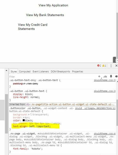
When I change value in the Console, the first button
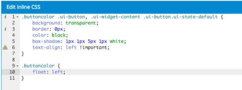
This is what I had tried
.buttoncolor .ui-button, .ui-widget-content .ui-button.ui-state-default { background: transparent;
border: 0px;
color: black;
box-shadow: 1px 1px 5px 1px white;
text-align: left !important;
}
That’s strange…
Are there any parent elements that cause this (e.g. with margin/padding or float?)?
I’m overiding the default css inherited from parent I believe.
As show in image below, it says Inherited from div.nx…

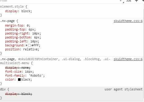
And here’s the style from the parent.
I tried to uncheck/change each piece, but the margin left did not change…

I’m very new to CSS and console, so if need anything else, feel free to ask
And thank you for helping me 
No problem 
Maybe you’re not specific enough with the CSS definition (.parent>.child>.anotherChild.etc… starting from the page-title and then all the way down to the buttons. More on that here)?
A Screenshot of your DOM would help as well (or some HTML while you’re at it to analyze it further) 
Nothing I tried work , so thought simpler to clone that page and leave only this section, so i can share XML
Here it is.
<h3><span style=“color:#0000FF;”><ins><span style=“font-size:18px;”>Quick Links</span></ins></span></h3>
.hidetablefooter .nx-list-footer {
display:none;
}
/Float Button Left/ div .title-buttons-left .nx-header-right { float: left; }
.buttoncolor .ui-button, .ui-widget-content .ui-button.ui-state-default {
background: transparent;
border: 0px;
color: black;
box-shadow: 1px 1px 5px 1px white;
text-align: left !important;
}
Thank you
Ok so this is what I came up with:
I don’t know if it was a funny xml or what not, but the panel with the buttons was set to “Panel Position Left” (on that panels properties) and the PageBuilder was displaying funny stuff because of that. I set that to Right and it looked already better.
In your CSS (buttoncolor) I added the following definition:
.buttoncolor { float: left; }
After that the buttons behaved as you want to have them 


Hope this was what you were looking for 
Cheers
EDIT: You can remove the text-align: left, since it puts the button text into divs which already use (by default) text-align: left
Thank you very much for your help!
But now i’m facing a different issue because of that css…
Seems like I need to learn css ASAP if i want to be able to do changes like those. It’s a lot less straightforward than i would have believed…
Even though I applied on css class a Unique ID(.buttoncolor) and only added that class to some specific title components… now, every popup in page show with buttoncolor css, even though it’s not applied on any of those components.
Even if I remove completely the unique id from any component, it still does it.
Tried changing the UnqiueID to something else (.button) but same issue…
Looks like the css is being applied by default instead of only components with that class name.
Below is a screenshot of one of the popup…see as all colors are gone from that popup…even thought it’s page tile has no reference to class and is on a completely different panel!

But anyways , you have been very helpful and I do not want to take up more of your time. So unless it’s extremely simple for you to see issue, it’s ok. I’ll figure it out eventually
Thx
Hi Dave
Don’t confuse CSS classes with DOM-ids 
Of an id there should only be one on the whole page, while classes can be applied to thousands of elements in the same page (thats why skuid generates a unique ID for us. We can modify that id but it still has to be unique  ).
).
I think you’re still not specific enough with your CSS for those buttons (the one where you set the background color, etc…).
A way to approach this is to inspect the HTML (right-click -> inspect on the page title) and then work your way all the way to those buttons you want to have styled. Then give the page titles a class (only on the ones where you want to change the style of the buttons) and the whole path of DOM-elements and CSS classes after that (the reference on how to do that should be above in one of my posts).
If you do that correctly only the buttons you want to change are styled the way you defined it.
If you get stuck on it, you could also post a more detailed example XML of your page and I could have a look at it.
Always glad to help.
Cheers
Hi David,
Most of you explained I understand and has already applied, but it seems issue was in the css itself.
Playing around with it , i decided to remove 1 piece a time to test and see if would make a difference and it did!
Instead of :
.buttoncolor .ui-button, .ui-widget-content .ui-button.ui-state-default
I tried
.buttoncolor .ui-button, .ui-widget-content .ui-state-default
(removed the 2nd “.ui-button”)
And no idea why, but now it behaves as I expect!
So 1 last issue to tackle for this and I’m done!
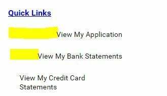
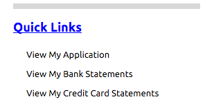
There’s still a indent right on those 3 buttons (it’s not aligned with above text “quick Links”)
But thank you very much, I feel you helped me learn a lot of new material that is sure to come handy in the near future!

Nice to hear that 
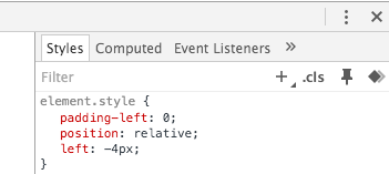
The indent is caused by the padding-left on the .ui-button-text CSS classes. By removing that (“padding-left: 0”) and adding “position: relative” and “left: -4px” I was able to achieve that in the developer console.
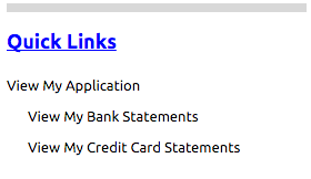
The final result:


The only thing left for you now is to add that CSS to your CSS-file (maybe you need to use the important statement) and you should be good to go 
Cheers
