Sometimes from a usability perspective, it makes sense to show more than one line/row of text.
For Example, I have a “Notes” field on the right side of a page and about 10 rows of info to input on the left side. It would be great if I could specify more than one line of text for my stuff on the right. I know that with Text area, we can expand, but sometimes I have 10 rows to the left and it would be great to have 10 rows of editable space to the right. It would match, make more sense, and be a better experience.
This basically allows the user to input text without being stuck in a tiny box.
Additionally, I’ve used .nx-page { font-size: 75%; } to decrease the size of my font… but that doesn’t seem to apply when inputting text.
So sometimes we are stuck with a tiny text field where we can only input a few words that are visible at a time when we have the space to allow more. It would be great if we could have the text be smaller as well as make the text area or even tex field, 10 lines by default (or 5 or whatever)
Thoughts?
You can manage the font size and size of reach areas by using CSS.
“.nx-field textarea” class give you capability to specify width of text area and font sizes.
I’ve already done this. So, this doesn’t solve Editable areas. How do I decrease the size of editable areas specifically.
Additionally, this doesn’t solve the issues of lines. So for instance I am going to do 10 line breaks right now.
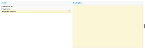
How do I do that? See the space above? I want an editable region, let’s say a text area. Where it shows 10 lines and is at 75 font size%. This way there is a text box that actually takes up a designated piece of space on the page and while we type, instead of being stuck on one line… we can view what we have typed.
Maybe this will make it easier to understand. See attached screenshots.
Here’s how I’d like it to work.H
There is no shortcut here. What you have to do is dig into the styles that generate the page and figure out what classe are driving the display. Then create CSS resources that more specifically target the page element with a different style.
A key tool in this effort is adding CSS classes to fields or sections of your page - this limits the effect of your override to just its intended targets.
In this case I made two changes.
1. The Text area field was given the class “bigTextArea” and in the CSS resource I added:
.bigTextArea .nx-field textarea { height: 355px; }
Note: You can give the text area an absolute height, but not a percentage of the page.
2. The reference field was given the class “smallText” and this CSS was added:
.smallText .ui-autocomplete-input{ font-size: 75%; }<br>
This produces the following: 
Hope this helps.
Wow thanks guys, this helps out a lot.
Enter your E-mail address. We'll send you an e-mail with instructions to reset your password.

