Currently, the table layout provides records as rows, and fields as columns. This is obviously pretty standard and works 95% of the time. However, there are certain instances when screen real-estate would require the opposite. There are also situations where it would be more intuitive for the user to work this way. (e.g. a few records with lots and lots of fields) How hard would it be to make a table component treat records as columns, and fields as rows?
Greg, this is an interesting feature idea! We don’t have any immediate plans to implement this, but have thought about it before.
Zach, why is it an interesting idea to try and fit the form on a page without having to scroll sideways. Please see this form https://blackdoginstitute.secure.force.com/forms/EducationBookingFormv2 - what do you suggest we do to overcome the side scrolls? It’s a pretty poor user experience as it is now. Tks.
Leah, thanks for reaching back into the depths of our forum and pulling forward a request. Its especially cool since we delivered this functionality in the Superbank release and I can brag about it here. And answer your questions!
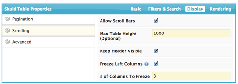
Tables now have scrolling options that can be used to get the side to side scrolling you are looking for. In the Table Properties - look for the “Display” tab and open the scrolling section. Here is the definition for a table I built.

Some notes:
- You have to have a defined table height in order to expose side to side scrolling. Just by giving a Max Table height value - you will get side scrolling.
- If you decide to freeze left columns, realize that the icon column is not counted. If you freeze 1 column it would always show both the icon column and the “Please Select Course” column from your example.
- Scrolling will not work if you choose to add table drawers. They just don’t play well together. Sorry.
- Be aware that scrolling utilizes pretty advanced browser features that are not super well supported in IE and Safari. You may have some funkyness if you use those browsers.
That should get you the effect you are looking for.
Zach,
You’re saying “Tables now have scrolling options that can be used to get the side to side scrolling you are looking for”.
No, that wasn’t my question. In my original request, I was asking: What do you suggest we do to overcome the side scrolls?
I do not want side scroll (why would anyone want to have a side scroll?). Have a look at the linked file… whether the side scrolling is done by the browser or via the Skuid UI, it remains a side scroll.
Yes, we have a lot of fields, and hence the scroll, but is there any other way around this, ie being able to display (or navigate throught) all the fields without a side scroll? Your urgent attention would be appreciated as we only have a few days left for the trial, and we need to make up our mind about Skuid if this isn’t resolved.
Thanks,
Sako
Additionally, we’re open to using a different method to achieve the same result at https://blackdoginstitute.secure.force.com/forms/EducationBookingFormv2 - maybe a tab set? Would that work?
I might be able to resolve the issue if you tell me how I can break (
) a label of a field. I tried this tag and also
but neither worked. If I am able to break the labels, then the result would be a shorter field, and hopefully as a result, I can start fitting all fields in teh same screen
Thanks
Sako
I would reccomend putting the fields for adding courses into a field editor. Above the field editor add a page title (with no title or subtitle) in which there is a button that adds another row to the course model. This will add another copy of the field editor to the page. This will allow you to add as many rows as you want. I believe this will accomplish what you are after.
The Table Header will not accept HTML code. However you can overide the CSS for that element so that the text wraps.
Add a CSS Class to the Table (Look at Table Properties – Display Tab – Advanced node)

Then add a CSS item to the resources tab and give it this code.
.className th { white-space: normal; vertical-align: top; }
(the first name in the CSS code needs to match whatever class name you assigned in the table properties - but needs to have a period in front of them)
That will wrap the lables and align them to the top of the header.
Skuid,
A transposed table would be really handy for a couple cases I’m working on now. Any reason we’ve abandoned the idea of a transposed table component?
For example, when we’re looking at the results of several tests that were performed over the course of several weeks, it’s much more natural to read that table with the Dates as the column headers, where the column holds a ‘row’ of salesforce data, and the row headers are the fields.
We’re used to looking at time horizontally, not vertically.
Skuid–
Any further comments on this idea? What’s the rationale for not adding a transpose feature to a skuid table?
I have several use cases for this and have been actively searching for an answer. I am working on a work around that I will share if it works.
Big vote to add this!
I have a pretty massive work around for this where we use the MODEL_LOOKUP function in a UI-only formula field to pull in the value of each record in a model to a field in another model, so you essentially see one value of each record going across, almost a pivot table. It’s really complex and also you have to know what your max number of records will be, or use a dynamic model creation code… and then after all that, the values aren’t editable.
This would be pretty amazing if you could simply transpose records to columns and fields to rows…
Enter your E-mail address. We'll send you an e-mail with instructions to reset your password.

