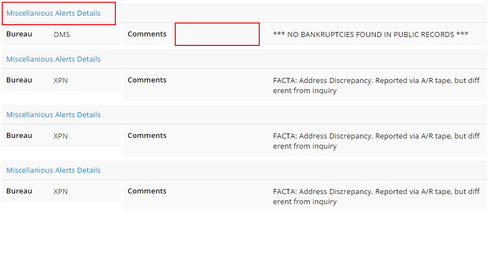
Please find the attached screen,
- i dont want to repeat the header multiple times
- how to reduce the space between “Comments” and the detailed comments

can any one help me out from this issues. Thanks in advance
Please find the attached screen,

Umm. Why are you not using a table here?
The field editor does have a setting for “labels above values” that might work.
You can also override the css of the class: nx-basicfieldeditor-item-label so its width is less than 40%. (and adjust the 60% counterpart). Dig into the developer console to see the classes and make real time adjustments.
Hey Rob,
I have a different somewhat related issue. I’m using a table and I’m getting single spacing between rows. When I add a Boolean checkbox field to the table, the spacing becomes double. Is there something I can do about that? I should note that this is an aggregate model, if that makes a difference…
Without checkbox
With Checkbox
Enter your E-mail address. We'll send you an e-mail with instructions to reset your password.