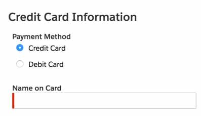
Hi,
I have a picklist field (Payment Type), which is rendered as RADIO_BUTTONS on UI, but it gives them as a column list of radio buttons like shown below.

How can I get these side-by-side (horizontally placed) ?
Hi,
I have a picklist field (Payment Type), which is rendered as RADIO_BUTTONS on UI, but it gives them as a column list of radio buttons like shown below.

How can I get these side-by-side (horizontally placed) ?
Add the following inline CSS to your page (or to your Custom Field Renderer if you’re using that):
.nx-radiowrapper {
display: inline-block;
}
Hi Zach,
That works nice!
But I have several fields of same type (RADIO_BUTTONS),
but I want to apply this only for a single field .
SO what I did is that - created a CSS class in inline CSS:
.paymentMethod{
display : inline-block;
}
And applied this CSS class at field Properties.
But no luck.
Any idea how to get this applied for only one single field ?
Also when applied to see how that works for :
.nx-radiowrapper {
display: inline-block;
}
The fields are like shrinked and instead of full picklist value being shown it’s like:
(Wrapped Content)

I tried to adjust the column width as flexible but no luck int his too.
Note: Bold/Highlighted content was just intended to make content eye-catchy and more readable.
Thank You!
KVin, change your CSS class to be this so that it is saying “within the .paymentMethod field, change the css of all .nx-radiowrapper areas to be something different”
.paymentMethod .nx-radiowrapper {
display: inline-block;
min-width: 11em;
}
I’d adjust the min-width to get it to be wide enough to fit the full picklist value on one line.
Awesome!!!
Thanks Zach.
It works great!
Enter your E-mail address. We'll send you an e-mail with instructions to reset your password.