I’m re-designing our current home pages and noticed a cool feature in one of the Skuid Dashboard videos, but haven’t found a way tor replicate the effect. I want to add filters for my visualizations; however, there remains some white space in-between the filter & table. I was wondering if anyone had a quick suggestion/addition to my CSS resources that could accomplish this.
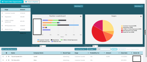


Current CSS Resource:


/* hide footer in table */.hidetablefooter .nx-list-footer {

display:none;

}


This is a snapshot of the video I was looking at
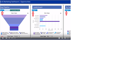
I suggest you put each of your chart with the related table into a responsive grid division. Then add a class to your hidden tables.

Your css will then look like this:


.yourClass .nx-conditioncontainer{

z-index:100;

position:absolute;

margin-top:30vh;

margin-left:30%;

}


Play a little bit with the margin, until it fits.


Responsive grid made a huge difference, thanks for the tip! Now I have your CSS on the right and my hidetablefooter on the left. The resulting white space on my original CSS is acceptable but I wanted to post for anyone else replicating this effect.