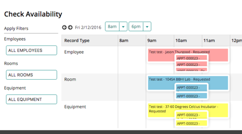
We have complex schedules, and department managers would like to be able to see a lot of information on one calendar.  The standard day scheduling view is still a little compact even though it is grouped.  

In order to improve legibility I would like to modify the standard Day Scheduling view as follows:

  • Increase overall height of the Day Scheduling View

  • Increase padding between events on a single day


Can something like this be accomplished with CSS?

Jason~


Can you clarify what you mean by increase the overall height? Are you referring to increasing the height of each event, the whole page, or something else?


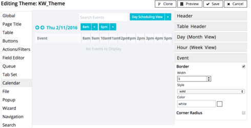
A simple way to increase the padding between events is to increase the border width for events in the theme that is assigned to your page.


Thanks!

Karen


This did not add padding between events in my case.


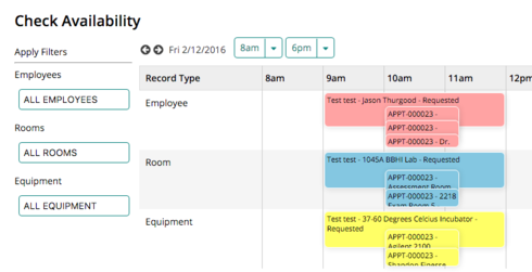
Increasing the border resulted in this:


Which only made it harder to see information. Found the setting that you can check or uncheck which ensures events don’t hide one another, but can’t seem to find a way to make the calendar expand. It seems it wants to cram as much into a small space as possible.


Other ideas?


Reply