Salesforce has the gauge chart capability, which allows us to set revenue goals and see where our org’s progress is compared to the goals we set. I can’t seem to find a gauge chart option in Skuid (potential idea?). If other people have an idea for a work-around to incorporate some sort of goal-setting capability in the chart components, I would love to hear your ideas! Thanks!
Perhaps graphing a “percent to goal” field that takes the current achieved amount divided by the goal amount expressed as a percent…
Hmm that’s a good idea! I tried creating a ui-only field for the goal and the percent of attainment, however, im not positive the percentage is working. Do you know if there is anyway to show the sumAmount on top of the goal to show the comparison? Or do you have any other ideas on how to graph the comparison. Here is my xml:
5000000
{{{sumAmount}}}
<p style=“font-size: 13.3px; text-align: center; background-color: rgb(255, 165, 0);”><span style=“font-family: tahoma, geneva, sans-serif;”><span style=“color: rgb(255, 255, 255);”><span style=“font-size: 24px;”>Goal MTD % Attained:&nbsp;</span></span></span><span style=“color: rgb(255, 255, 255); font-family: tahoma, geneva, sans-serif; font-size: 24px; text-align: center; background-color: rgb(255, 165, 0);”>{{PercentOfGoal}}</span></p>
<skuidvis__chart model=“OppsClosed” maintitle=“Goal MTD” type=“column” uniqueid=“sk-2QHpf_-616”>
line
spline
area
areaspline
column
bar
</skuidvis__chart>
I have a love-hate relationship with UI only fields. I can’t seem to get them to work the way I want. many times. I have much better luck with Salesforce fields. You can use roll up fields to aggregate current and goal amounts of children records on a parent and use saesforce formula fields to calculate current/goal = %complete. Skuid Charts have a lot of options. It may take some work to get them to display your data the way you want it.
In Skuid, I do a side by side column chart. The two columns are series built from different models. One model is the goal number. The other model is the actual number. Its not a gague, but its an effective display of progress.
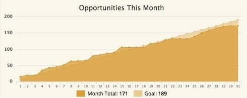
It isn’t exactly a gauge chart, but I built these cumulative area-spline charts to show our day by day progress towards a monthly goal. It’s also a pretty hack-y way to do this, so someone else might be able to simplify/improve it.

Like Rob said, I use two models to handle the two data series. To create the goal, I have a custom object in salesforce, “Goals”, that holds the amount, date, and type of goal, which I create each month using Demand Tools. I then use a javascipt snippet to accumulate my daily total and render the chart. This code is only set up to handle a chart with 2 series, where the first series is the goal and the second is the daily total.
var chartObj = argumentsr0], $ = skuid.$; if (seriesCount \> 0) { var cumulative = a]; var temp = 0; var today = new Date(); var dayInMonth = today.getDate(); // starting with the second series, add a cumulative total for each day of the month so far for (var i = 0; i \< dayInMonth; ++i) { temp += chartObj.seriesj1].data[i].y; } cumulative.push(temp); } var newSeries = { id: 'Cumulative', name: 'Month-to-date Total:', data: cumulative, type: 'areaspline', xAxis: chartObj.seriesj0].xAxis, yAxis: chartObj.seriesj0].yAxis, }; // replace second series with new cumulative series chartObj.seriesj1] = newSeries; // console.log(chartObj); }
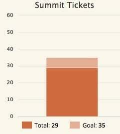
I also use this method for some charts and stack the columns, using a UI-Only field to hold the goal number and another one to calculate the difference between the current result and the goal (if the total < goal). Then I stack them in the proper order to make it look like this:

I went a little further and added a third UI field which calculates if the total is greater than the goal and made it be a different color to indicate when we exceeded our goal. I created custom labels for the charts to display the goal total, but you can use the standard label functionality if you’re okay displaying the amount to reach the goal instead.
Enter your E-mail address. We'll send you an e-mail with instructions to reset your password.

