Hello Skuid World!
I have several Skuid pages I’ve developed for a Salesforce Experience site, but I see differences in the preview on the Skuid side versus what it looks like for end users accessing the experience. My text components are inserting a space after the horizontal line in production, which doesn’t show up in the preview. It’d be great to remove this white space and have the preview match the production experience, but I’m stuck on how.
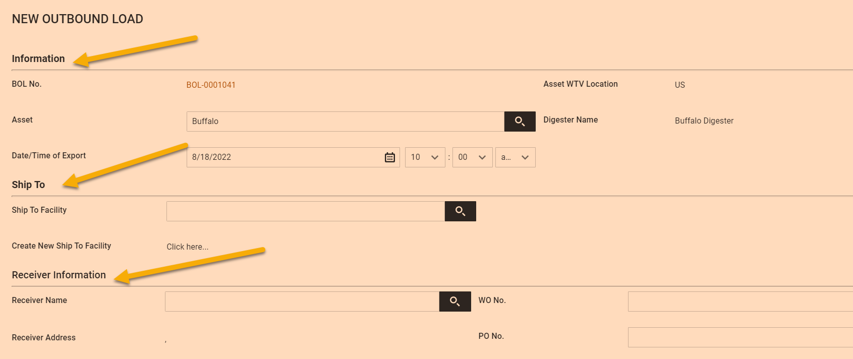
Preview, as expected without spaces:
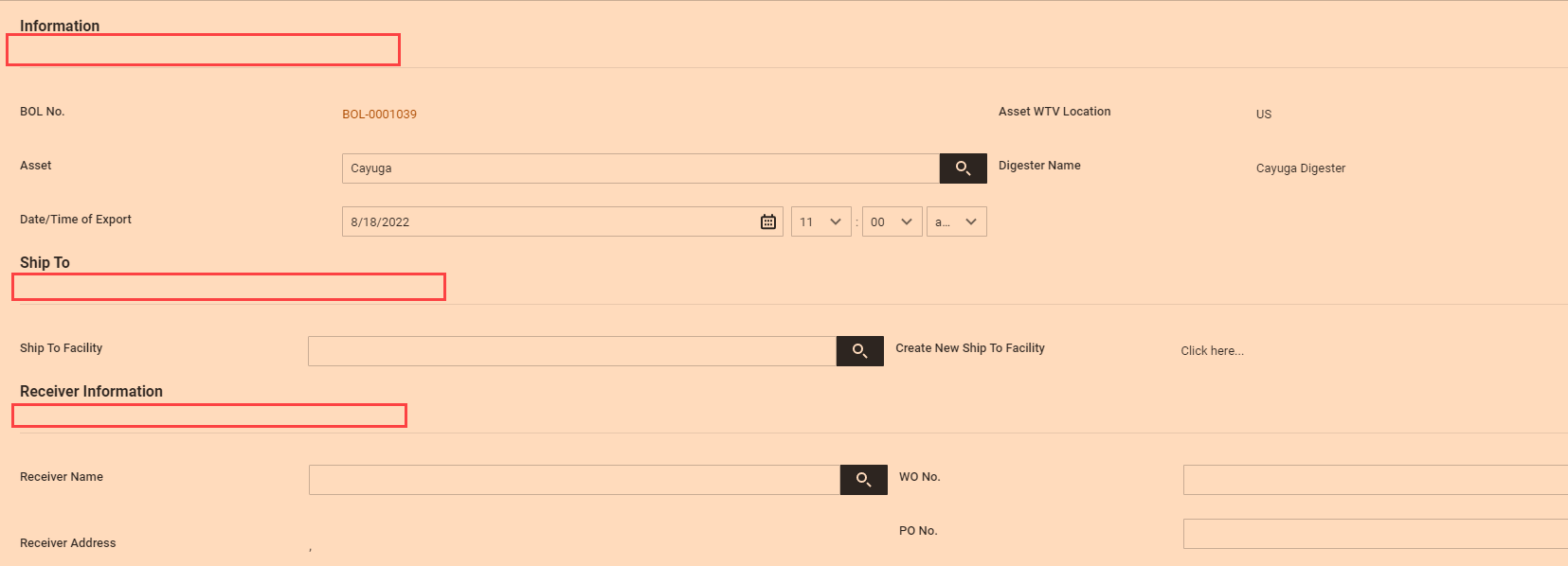
Actual rendering in production, with additional spaces:
Inspector look at component - it isn’t a second piece, or part of something in Salesforce, it indicates this is my Skuid component with the space:
I have no custom CSS active in my Salesforce Experience.
Any help is greatly appreciated - even if it is just an explanation as to why this happens and not a work around to make them match.
Best
Chris


 use a header component (which has the option for a border separator)