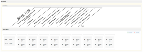
I am working with the Template and Field Editor components and I need them to line up because the Template is an image of a table and the Field Editor has pick list options for the answers. I need the two components to stay the same size regardless of screen size. Right now they are both dynamic and depending on your screen the questions and answers stop lining up. Any help would be greatly appreciated.
To get the two components to line up side by side you need to put them in a Panel Set component. If you choose the Panel Set Type “Fluid with Sidebars” and then select the left panel - you will be able to set its panel width property (in pixels). This is a fixed property and will not change as the screen resizes.
The trick is then that you need to add another panel. Select the Panel Set again and “Add Panel” The new panel will be between the two panels - and will also have a “panel width” property.
The last panel in this model will just take up the remaining space. You can probably just leave it blank.
In my testing this works as you change screen size. It also seems to work as you increase or decrease the zoom factor in your browser. (I’m using Chrome). At some point its going to fail, but hopefully it will be as flexible as you need.
Hi Rob, I should have clarified that these two components are on top of each other. There is no option to set a width. If I utilize the smaller left side sections I have a width option however using the longer right side sections I am not getting a width option. I have included an image so it is clearer. Thank you for your help. 
Aha!
The column width property on the field editor can work in “fixed with” form. If you write your property like “200px” instead of “25%” it will interpret appropriately. The columns from your image are pretty narrow.
Two other ideas:
1. Set your field editor to “Field Layout” property to be “lable above field”
2. In the custom lable fields just put a space. This will make them seem to disappear.
I think this will work well for you.
One more tricky thing that some people miss. To get the column width property - you have to click on the grey bar a tthe very top of the column. Its a pretty small space and easy to miss.
Hi Rob, Thank you for all your help as always. The trick was using px instead of % and adding a static height and width in the image code. Thanks!
Reply
Enter your E-mail address. We'll send you an e-mail with instructions to reset your password.
