I have a table with lots of filters. Sometimes when multiple options are chosen in the filters, it causes the remaining filters to “wrap” above. This is annoying in itself and is my first issue. Is there a way to keep the filter boxes the same width and not have them expand? My second issue is when they do expand, it causes other filters to be pushed up above the main filter line. And when they do this, they cover up the labels of the filters on the main line. 
Which version of Skuid are you running? We’ve seen this on older versions but have fixed it in newer versions. It could be time to upgrade.
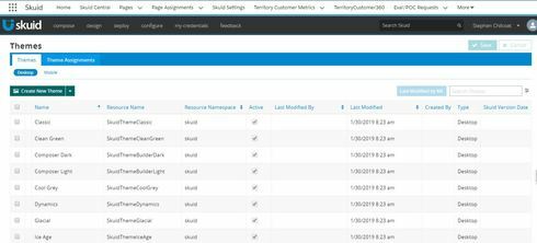
Are your out of date themes updated? This isn’t the same as upgrading. There is a button in the top left of your themes pages. I’d recommend giving that a shot.
Can you share your XML for us to take a look at?
We just installed Spark and it is still an issue. Even when we change themes. I saw another post that is over 3 years old about this issue. Are there any plans in the works to resolve it. Here is another screenshot with a Classic Theme
Thank you for the screenshot. Looks like I could reproduce the issue. I’d say there are two different issues, because I couldn’t reproduce both in all Design Themes:
1) Filter input fields may overlap with the labels of other filters when they wrap
2) Filter labels may overlap each other if a selected filter value is narrower than its label
In order to get more information for our development team, could you please reply to the following:
1. Which Spark version do you currently use?
2. Do you see this on V1 pages?
3. Do you see this on V2 pages?
4. Did you see any Design Theme where one or both issues do NOT appear?
We are on Spark version 12.0.2. I do not see a button to update Themes.
We are on Spark version 12.0.2. I have seen the issue in the Classic Theme and the Lightning Design theme. Those are the only two we are using. I have not tried it in all of the other themes. And I concur with both of your findings. They overlap when they wrap and also when the filter is narrower than the label.
Thanks Stephen, I’m taking care of it.
Reply
Enter your E-mail address. We'll send you an e-mail with instructions to reset your password.

