Hi Paul, the first suggestion we’ll make for something like this is to make sure your themes are not out of date after updating to a new Skuid release. (Generally, this should always be done right after updating your Skuid version, and needs to be done manually). If this still needs to be done, you’d see a button on your Themes list page towards the top right that’d let you Update out of date themes. If that’s not visible, it means your themes are already up to date.
If this doesn’t help, can you say whether there is custom CSS involved in this queue section? If so, there may have been some changes to the themes between 8.15.10 and 9.5.x that are overriding the custom CSS. Or, the class or CSS Selectors that you’re using in your custom CSS could have been changed a bit between the two versions. Are you able to inspect the HTML and see if the missing contents are part of the HTML (and just not displaying properly) or if they’re missing altogether?
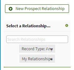
Hey Mark. Thanks for getting back to me on this. I just updated the Themes (thanks for the heads up on that one) and I now see the two filters. However, they still aren’t quite right. In the current production page, those fields are the same length as the search field above them. They are now showing, but shorter in length so that the test is overlaying the drop down arrow.
We have a custom theme, but are not using CSS. Here’s what I’ve got now:

There is an issue that comes up from time to time, in which custom themes need one extra step for updating. It may or may not be necessary in your case, but it’s easy to try, if you don’t mind:
- Edit your custom theme
- Make any change to a setting, to enable the save button
- Undo your change (unless you want to keep it)
- Save the theme
Good morning Mark. I tried your last suggestion but it did not correct the issue. Also, after a bit more digging I determined that we are using some custom CSS. It was set up on the master page so I didn’t see it initially. Unfortunately I am not familiar with CSS. Please let me know if you have any additional ideas.
Thanks.
One other thing… After making the change to the theme, saving the change, reversing the change and saving again, when I attempt to open that custom theme, it now just sits at the Loading Theme Composer page and never actually opens.
We have been able to reproduce this issue, and will log it as a product issue with our development team. We will update this post when the issue has been addressed.
If you are looking for a way to try and work around this in the short term, you might try adding an inline CSS snippet to your page like this:
.nx-actionselect-dropdown-item { <br>padding-right:50px;<br>}
which pads the right hand side of the dropdown’s text. Feel free to adjust the 50-pixel value if you need, and be sure to check that it doesn’t have any unintended effects on other page elements (I don’t believe it will). Once you update to a version of Skuid that has this issue fixed, you’d want to delete the CSS snippet.
Thank you Mark! I added that Snippet to the existing inline CSS and the fields are now displaying correctly. I appreciate all of the assistance.
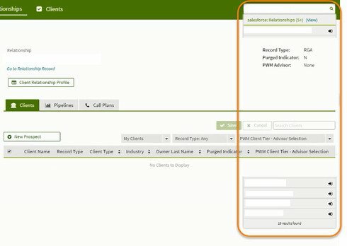
We have discovered another issue that I believe to be related to the previous. Our Master page contains the global search field with other sub pages that are displayed on the Master. We have found that if we are in two of the three tabs and use the global search, the results are displayed partially UNDER the page. I’m assuming this is related to the original issue. Here’s what it looks like:

We are seeing this when searching from a summary list as well as if we are in a detail record.
Please advise if there is a workaround for this. Thanks!
Paul, on the tabs that are affected by this overlap issue, are you using page includes? Or, is there a component common to both affected tabs?
In both cases we are using page includes. This is happening under the Relationship tab off the Master page, but not the Client Tab which is also on the Master page. However if you click on a Client to drill down to the detail level and try to search from there we see the same behavior.
It sounds like you may have run into this known issue:
https://community.skuid.com/t/search-box-on-page-with-header
There’s a possible workaround discussed in that conversation that you might want to experiment with. Both issues are on our radar, and we will reach out once the issue has been addressed.
Thank you Mark. I’ll give that snippet a look and see if it takes care of the issue.
I pulled the snippet from the other entry and it does not correct the issue. Do you know the latest version in which this is working correctly and are there any potential issues in downgrading from 9.5.3 to that version? This issue has essentially made the search function unusable for half of our pages.
It turns out the snippet in the post I linked above corrects a related but different issue. Sorry for the confusion. You should be able to add the following CSS snippet to your parent/master page (i.e. one level above any page includes) to push the Page Include ‘back’ behind the drop-downs and other areas that are supposed to be ‘in front’ of the rest of the page contents. If using this, be sure to test all pages well for any unintended side-effects.
.nx-include-panel{ z-index: 0;<br>}
This also only appears to be an issue when the standard Salesforce header is being displayed. Our dev team is aware of this issue, and we will be working on addressing it in an upcoming release. The workaround here should be removed once you update to the Skuid release with the fix (and always be sure to update out of date themes).
Hello Paul,
Thank you for your patience! Skuid has addressed the issue you raised regarding the Queue Filter text overlapping the dropdown arrow (issue CORE-17) in the new Brooklyn Update 1 - Iteration 7 (9.5.7) release which is now available on the Skuid Releases page.
As a reminder, Salesforce does NOT allow reverting back to prior versions of managed packages. Skuid always recommends installing new versions in a non-business critical sandbox environment to test all mission critical functionality before installing into a production environment. We also recommend that you update out of date themes when you upgrade. Please let us know if you continue to encounter any problems with this issue after upgrading.
Thanks again for alerting us of these issues!


