
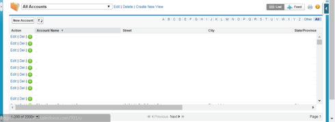
Does anyone have some sample CSS to share where you have successfully rendered a table’s contents dynamically based on the browser window size?


This would be identical to standard Salesforce list views. If you display 200 records and re-shape the window, the amount of table rows visible becomes more or less but the bottom of table always remains 100% in view.


Full browser window:


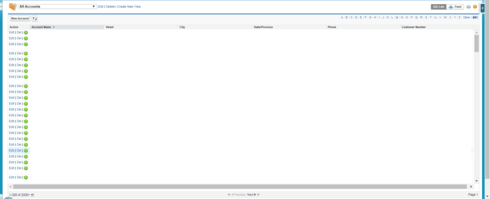
Resized window: Number of rows visible is less, but the table bottom is still in view.

There is a setting on the table of “allow scroll bars”. You can put the table in a wrapper component and set the wrapper component height to something like 90VH . This will adjust the height with the height of the screen.


I wish it were that easy, but that doesn’t work as expected unless I am missing something. Resizing the window while using a wrapper with a set VH keeps the height of the original window before resizing. It is not dynamically keeping the entire table in view based on window size. 


Resurfacing this. Does anyone have a clue how I can get these containers to stick to the bottom all the while adjusting accordingly. 


You could probably do something like:


.table-wrapper {<br>max-height: calc(100vh - 100px);<br>overflow:scroll;<br>}

Where the 100px is the combined height of your header/footer, assuming they’re not dynamic.


Thanks a ton! This has bothered me for months!

For anyone curious (my use case solution):
I put my table component in a wrapper component w/ the following properties:
.table-wrapper {max-height: calc(100vh - 144px); overflow: hidden;}

Then I added the following properties to my table component via the table id:
#sk-37_fTl-194 .nx-editor-contents {height: calc(100vh - 254px) !important}

The table now fits snugly at the bottom no matter what size screen is being used.