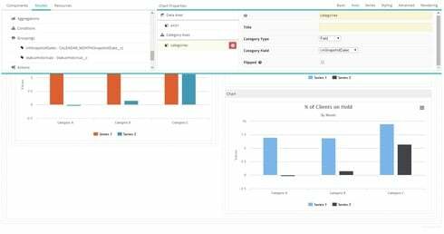
I am having trouble figuring out how to change the axis labels on charts. I found another topic that used a snippet for a table, but was not able to make it work.
I’ve gotten my model grouped by “CALENDAR_MONTH” and my category axis using the same model field. So my chart looks great, except it’s got 1, 2, 3, etc when I want it to display the actual month name.
Thank you for your help.


 return “August”; else if(this.value == 9) return “September”; else if(this.value == 10) return “October”; else if(this.value == 11) return “November”; else if(this.value == 12) return “December”; else return this.value; } } });