I would like to display on a user’s home page the number of records of an object that they need to take action on. An example would be text that says: “You have 6 New Cases” and the 6 would be the count of Case records, Status = New, Owner = running user. I see this as a widget (template?) on the home page somewhere. Even better if the text was a clickable link that takes the user to the Case tab. Anyone know how I can do this? Thanks!
If you want to display the current record count in a model, use {{$Model.modelname.data.length}} in a template component, swapping out modelname with the name of the model.
You’ll need a model that just contains new cases, with the conditions set for the running user and case status. Then you could have the following in a template component (remember to allow HTML)
You have {{$Model.newcasecountmodel.data.length}} new case(s)
Thanks Oliver. That is a great solution (And was what I was going to suggest myself… of course… )
This is working great. I am using a narrow component on the native Salesforce home page (for now) and unfortunately the link is opening the new tab inside the mini component window instead of the main browser tab itself. I’ve asked our website guys if they can help me tweak the html to get around that. But loving the record count logic!!
Two options.
change your link: <a href=“/500/o” target=“_blank”>You have {{$Model.newcasecountmodel.data.length}} new case(s) This will open link in a new tab or window.
Add some javascript to the skuid page. Follow step 15 of this tutorial: http://help.skuidify.com/m/supercharge-your-ui/l/117747-reclaim-the-salesforce-home-page (Yes, Step 15…)
Cheers.
Question on taking this a little further…
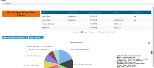
I’m going to attach a piece of a home page. My ultimate goal is to to have a circular running count under the orange “Upcoming Scheduled Tasks:” area basically a circle with the number inside. I’m hoping the circle will fill the white space under the orange area… Also the easiest way to get rid of all the white space between the top show feed area and the panel set which is roughly 3/4 of an inch, the white space between the orange and blue (panel set: left side is a template right side is a table) and the white space between the panel set and the filters for the graph. I’m going to be getting rid of the tasks per page ect. under the table. I’ve been successful with getting rid of the white space when I play around with the inspect element just haven’t had luck replicating it so that it will work. As for the circle under the orange area displaying a count down, even knowing if this is possible without having to code it from scratch would be awesome.
Thanks for any help! 
For the circle displaying the number of tasks - the template component will be your friend. You can put merge syntax in the template to include the number of tasks.
The formatting will all be done in CSS. A little bit of coding, but not hard at all.
Ok, I’ll give it a try, hopefully it will go smoothly.
Thanks!
Works great thanks again Rob!
Glad to hear!
How can I calculate a total value for a number field? For example, I have a number on each account record that a user inputs, e.g., 10,000, how can I use this feature to calculate all the values onto the panel or modify the formula: {{$Model.countingrecords.data.length}} to do so?
Hi Nirouges–if I’m not mistaken, you might be able to create an aggregate model on the account object and sum the number field. Then you can access the aggregate model’s field using similar merge syntax. Let me know if this walkthrough resonates with you–http://help.skuid.com/m/models-conditions-filters/l/102652-aggregate-models-make-dynamic-reports-in-…
Thanks Karl!
Reply
Enter your E-mail address. We'll send you an e-mail with instructions to reset your password.

