Working on building styling variants for our components and I ran into something i’m not sure is intentional or something I can work around.
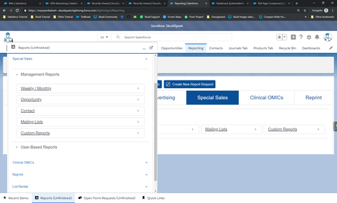
The style variant when applied to a Tab Container works great; however, when the Tab Container is stacked vertically due to page size limitations, it loses all its style settings. I’m hoping to be able to design a “Reports” page with direct links to relevant reports which can also be used in the footer icons. It just looks weird once it’s stacked vertically since the Tab Name’s are also scaled down. There’s no settings in the Design System that allows me to adjust the vertical tab settings but I would’ve assumed this is inherited from the Tab’s style variant.
Below is the same exact page, one with enough screen real estate to display fully, the footer has everything truncated and loses it’s styling.

