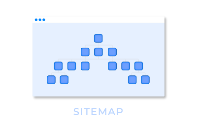
I’ve built a page with a wrapper, responsive grid and more individual wrappers/components to create containers as shown in the illustration.


However, when I output this, my components are not centered onto the page.


Can someone help me with some CSS code to get this centered onto a page?


Thank you!


A quick fix might be to put the wrapper in a responsive grid with 3 panels. Put the wrapper in the center panel. Set each panel to be flexible width with the same settings. Leave the two outer panels empty.


I actually have 5 panels setup; illustration didn’t show that 😦


If you configure it like this with the outer-most grid panels set to flexible with with the same settings, it should center 1b4e7ce5c310d10ab4484c9a337df07fcd97f9fe.png


closer.


The small x’s at the top are perfectly centered and on one row.


Mine as you can see are broken up but centered.


Ok seems like I got it.


Just need to close up the gap within the column gutter.


This is expanded 100% across my screen now.


Thanks!!!