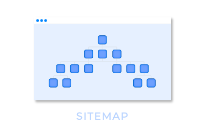
How would I best create navigation that will self-highlight from data-driven criteria?
Consider a portal for an application process. I’m thinking of a left navigation bar that contains components that brings content into the main part of the page (to the right of the navigation) when clicked. Each nav component (or perhaps just the text in it) needs to become a different color based on whether it’s data is in a specific status (submitted=green, unsubmitted=red, new information=yellow, etc). Since it is navigation, it probably also needs to be a different style when it is the selected navigation component as well, of course.
Let’s assume I construct a model that gets the statuses of all of the application elements. I could use the Skuid “Navigation” component to build the navigation tree, but I presume I’d need some CSS trickery and/or code to say “this nav item should be blue if x and yellow if Y”, right? Or is there an easier way? I don’t see how to style individual nav items, not to mention basing it on criteria.
I could instead render based on criteria, but that will get clumsy when there are many navigation elements - I don’t want to create separate navigation items for every status of every element.
Perhaps instead of changing the style of each would it be easier to render an additional component next to the navigation, like a star image, that appears based on criteria? But I don’t see how to make that happen either.
Show me the light!
Peter did you ever figure this out? I’m needing to do something similar, not quite as complex, just show which Navigation item is the “current” one.
I’m thinking you could do something with merge syntax, if you can construct a boolean for each of your criteria, then you could do something like
{{#Submitted__c}}
I’m thinking I can use modules, so if the current page’s module is Patients, highlight the Patients item in the navigation menu.
I did not. We ended up having it partly not work well and also wrote some CSS that had to plug into specific pages to force highlighting. Spent mucho time trying ot make this work right. Perhaps some of the newer features will do this better?
Reply
Enter your E-mail address. We'll send you an e-mail with instructions to reset your password.

