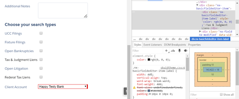
I’ve got a few checkbox fields in a field editor. Two of them are conditionally enabled. Because they are conditionally enabled, they have an extra bit of CSS applied to them
element.style { rgb(0, 0, 0);}
I assume this is because when they are disabled, this changes to
element.style {rgba(0, 0, 0, 0.298039);}
to allow for it to look disabled.
However, I am using the Lightning Design theme, and my basic .nx.basicfieldeditor-item-label css has a color: #54698d, so these conditionally enabled options look different even before they are disabled.
What could I do to make sure that my item label when enabled has the color #54698d?
In the screenshot below, Tax & Judgement Liens and Federal Tax Liens are the two conditionally-enabled fields.