I’ve created a column chart that displays 8 different “series,” grouped into two groups. The data seems to behave properly, but the chart displays the columns with an odd spacing. The category is using the “owner name” which, doesn’t exist for one of the groups, thus the null label on the axis.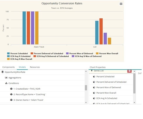
Is there an easy way to fix this spacing issue?

Page 1 / 1
I’m pretty sure that each of the 8 series is taking up space. It simply is that in the first category, series 1 - 4 are 0 and in the second category series 5-8 are 0.
Not knowing your data model, its impossible to tell for sure, but if you could ouput this as two series, with splits in each series, this might give you what you are after.
Thanks, Rob. Unfortunately, I can’t get all these values in a single model/series due to the way these values need to be calculated.
I discovered if I alternated the two “groups”/series, it worked to make it look better. It’s still got the blanks that you mentioned, but at least they’re equally spaced now.
Reply
View our Community Site Map

Enter your E-mail address. We'll send you an e-mail with instructions to reset your password.