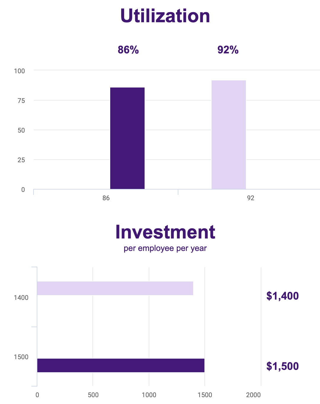
Has anyone been able to get a chart column or bar to be a fixed width? The responsive design is great, but my bars and columns are just too skinny!
Be careful not to define BOTH a category axis and a series Split that uses the same field. That makes the columns SUPER narrow, cuz in each category you are putting space for all the split columns - of which only 1 has data.
that’s a good warning. thanks Rob. i’m not using splits though, so does that make having my category
axis field and series field the same ok in this case? here’s the behavior i’m seeing:
Ok. I think this is a similar problem. It looks like you are using two series to get the different colors. In this case I believe you have a similar scenario where the “missing” column present in each category is what’s making the “present” column so narrow.
Does your data model support having this chart be sourced from one series?
Of you want the different colors you could add a split on that one series, but make sure its stacked.
Charts are hard. I’m sorry.
Reply
Enter your E-mail address. We'll send you an e-mail with instructions to reset your password.


