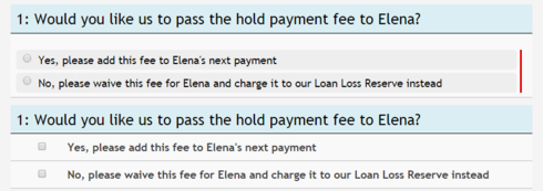
I would like to change the style of the radio button inputs on my page – for example, each answer is currently in a box with a grey background and no borders; the boxes are spaced apart from each other, and there’s little space between the radio button and the answer text. I want to change it so that it looks more visually similar to the checkbox fields on my Skuid page  I currently have the following CSS on this field, to stretch out the radio buttons to the width of the panel. I tried editing other attributes of these items (background color, border) with no success (since I’m editing the background/border of the field editor itself, not the radio button components when I do this): .allLabel .nx-basicfieldeditor-item.allLabel .nx-basicfieldeditor-item-label { width: 1%; } .nx-basicfieldeditor-section-body > .nx-basicfieldeditor-item.allLabel > .nx-field { width: 99%; } I also tried editing the multiselect settings under my custom theme, but that also didn’t yield the desired results. Does anyone know what item I should be editing the CSS attributes of or where I can go to edit these settings? Thanks in advance!
Page 1 / 1
Aparna~
Try adding some inline CSS: .nx-radiolabel {margin-left: 25px;} and alter the pixels so it matches what you’d like. This will alter the left margin on all radio labels on your page.
Let me know if you need more help with this!
Thanks!
Karen

Enter your E-mail address. We'll send you an e-mail with instructions to reset your password.

