I guess this is a question, but might also just be a solution; if I have worked something out right myself (Stupid isn’t stupid if it works, right?)
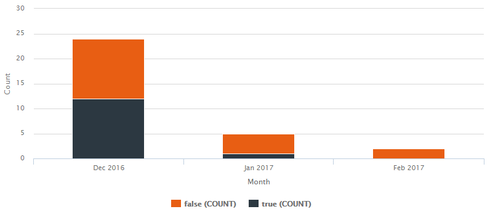
I need to do a stacked bar chart of Opportunities broken down over month by won status. Seems really simple right. I built my model of Opps, with the standard IsWon field and put them into the stacked bar chart appropriately, got to this point in no time:

It looked good to me, except the “Series” - which is showing the count of “IsWon” values in each month is reflecting it’s actual values… IsWon = false, and IsWon = true.
I couldn’t for the life of me work out in Skuid how to tell it to display something different here (and I guess its fair enough, as really the chart component doesn’t know what values are actually going in there until runtime (esp if the series was split over a picklist or date/text/number etc.etc.)
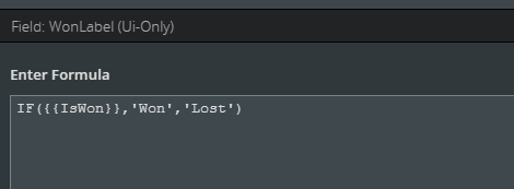
So what I did is create a UI only field on the model called “WonLabel” - which was a formula - and did this:

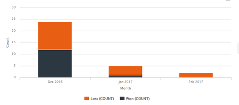
I then told the chart to split over the “WonLabel” field instead of IsWon and I now of course get this:

(and the mouse over values look great too).
So - this worked. I was pleased with it because of that… but I have an itch in the back of my head, because Skuid is normally so powerful and clever, this almost seems a little cheeky or hacky, which I am not used to! Are there any performance/memory issues I should be aware of with UI-only formulae? Is this a common practise, am I reinventing the wheel? (or maybe have I even just had a eureka moment!)
Also - out of interest, how do I get it to use “Won” as the first value and “Lost” as series element 2… first idea is just flip my Formula round - but might it be that the Series order from the values available is not stable any way?
