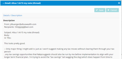
This has to be an easy one and I’m just not looking in the right place for the answer … Whether in a table or as a field on a screen, once that field is put into edit mode, it immediately shrinks down to two or three lines of text in height with scroll bars. When editing a long-text field (like a description) this is really frustrating and difficult to manage. In view only mode I can see a whole lot …  But once I hit Edit … it collapses down to this …
  How do I change this default? I noticed that even in this conversation window, the box that I am typing in expands as I add more text. That should be a feature available in Skuid screens as well.
Page 1 / 1
Unfortuantely that is a limitation of the browser’s text area field. It is very difficult to make the edit mode of that field dynamically stretch to show the contents of the field. We have explored some JS solutions - but all were problematic.
There is a CSS solution that can give the edit mode a larger height. But this is going to be a static solution.
Add a class to the description field. I used “largeField”
Then add a CSS resource that looks like this:
.nx-editor .largeField textarea {
height: 355px;
}
This will make the text area open to 355 pixels.
Hopefully that will work.
Reply
Enter your E-mail address. We'll send you an e-mail with instructions to reset your password.

